

Understanding Candlestick
A candlestick is a single bar on a price chart that shows four prices for a chosen time period, such as 5 minutes, 1 day or 1 week.
These four prices are called OHLC:
- Open – The price at the start of the period
- High – The highest price reached during the period
- Low – The lowest price reached during the period
- Close – The price at the end of the period
Parts of a Candle
| Part | What it Shows |
| Body | The range between the opening and closing price |
| Upper Wick (Shadow) | The highest price touched during the period |
| Lower Wick (Shadow) | The lowest price touched during the period |
| Colour | Indicates whether price rose or fell |
A Bullish candle (green candle) has its close higher than open. Buyers were stronger.
A bearish candle (red candle) has its close lower than open. Sellers were stronger.
Example:
If a stock opens at ₹100, touches ₹107, dips to ₹98 and closes at ₹105, it forms a green (bullish) candle.
The body runs from ₹100 to ₹105, the upper wick goes to ₹107 and the lower wick to ₹98.
Understanding Colour Coding
Colours make candles easy to read at a glance:
- Green (or White) Candle – Closing price is higher than the opening price. This shows buying strength.
- Red (or Black) Candle – Closing price is lower than the opening price. This shows selling pressure.
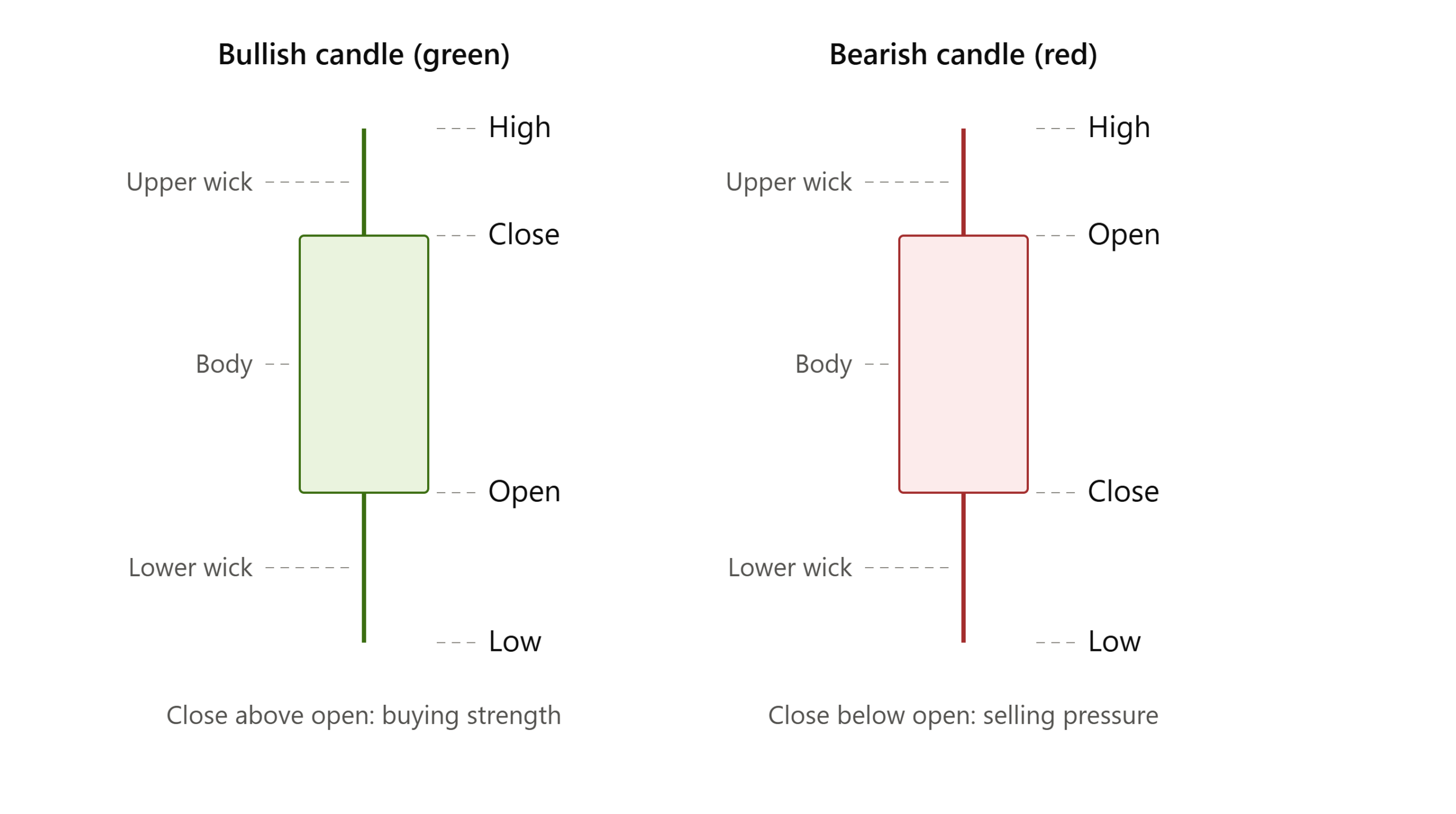 Most Indian trading platforms and apps use green for a price rise and red for a price fall.
So this colour system will feel familiar once you start looking at live charts.
What are the Types of Candlestick Patterns?
Candlestick chart patterns fall into three simple groups:
- Bullish reversal patterns – suggest a falling price may turn up.
- Bearish reversal patterns – suggest a rising price may turn down.
- Indecision and continuation patterns – show a pause, a balance, or strong one-sided pressure.
Bullish Reversal Patterns
Hammer
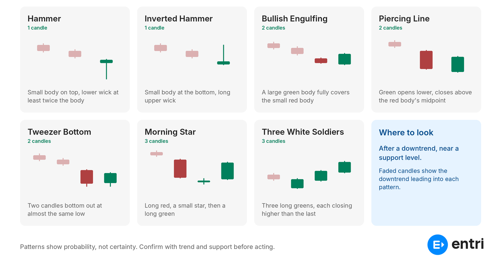
- Small body near the top, long lower wick (at least twice the body), little or no upper wick.
- Sellers pushed price down, but buyers pulled it back up before the close. It is useful after a downtrend, near support.
Example: A stock falls from ₹500 to ₹420, dips to ₹405 in a day, then closes at ₹418.
Inverted Hammer
- Small body near the bottom, long upper wick, little or no lower wick.
- Buyers tried to push price up. Selling has started to weaken. It is useful after a downtrend, near support.
Example: A stock at ₹250 rises to ₹265 during the day but closes at ₹252.
Bullish Engulfing
- A small red candle followed by a larger green candle whose body fully covers the red body.
- Buyers have overpowered sellers in one session. It is useful after a downtrend or pullback, near support.
Example: Day 1: ₹200 to ₹196 (red). Day 2: ₹195 to ₹204 (green).
Piercing Line
- A long red candle, then a green candle that opens lower but closes above the middle of the red body.
- Buyers recovered more than half of the previous day’s loss. It is useful after a downtrend.
Example: Day 1: ₹300 to ₹280 (midpoint ₹290). Day 2: opens ₹277, closes ₹293.
Tweezer Bottom
- Two candles with almost the same low, usually red then green.
- Sellers failed twice at the same price. It may act as support. It is useful after a downtrend, at a known support level.
Example: Two days in a row, a stock bottoms near ₹150 and the second day closes at ₹156.
Morning Star
- Three candles: a long red candle, a small candle (or doji) lower down, then a long green candle closing above the middle of the first.
- Selling slows, the market pauses, then buyers take control. It is useful at the end of a downtrend, near support.
Example: Bank Nifty falls sharply one day, moves very little the next, then rises strongly on day three.
Three White Soldiers
- Three long green candles in a row, each closing higher, with small wicks.
- Steady, strong buying over three sessions. It is useful after a downtrend or a long sideways phase.
Example: A stock closes at ₹110, ₹116 and ₹123 on three straight days.
Bearish Reversal Patterns
Shooting Star
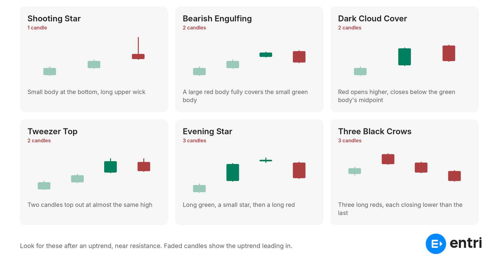
- Small body near the bottom, long upper wick, little or no lower wick. Same shape as an inverted hammer.
- Buyers pushed the price up, but sellers forced it back down. It is useful after an uptrend, near resistance.
Example: A stock rallies from ₹600 to ₹700, touches ₹725, then closes at ₹702.
Bearish Engulfing
- A small green candle followed by a larger red candle whose body fully covers the green body.
- Sellers have overpowered buyers in one session. It is useful after an uptrend, near resistance.
Example: Day 1: ₹400 to ₹405 (green). Day 2: ₹407 to ₹396 (red).
Dark Cloud Cover
- A long green candle, then a red candle that opens higher but closes below the middle of the green body.
- Sellers erased more than half of the previous day’s gain. It is useful after an uptrend.
Example: Day 1: ₹500 to ₹520 (midpoint ₹510). Day 2: opens ₹523, closes ₹507.
Tweezer Top
- Two candles with almost the same high, usually green then red.
- Buyers failed twice at the same price. It may act as resistance. It is useful after an uptrend, at a known resistance level.
Example: A stock tops near ₹880 on two straight days and the second day closes at ₹868.
Evening Star
- Three candles: a long green candle, a small candle (or doji) higher up, then a long red candle closing below the middle of the first.
- Buying slows, the market pauses, then sellers take control. It is useful at the top of an uptrend, near resistance.
Example: Nifty rises strongly, moves very little the next day, then falls sharply on day three.
Three Black Crows
- Three long red candles in a row, each closing lower, with small wicks.
- Steady, strong selling over three sessions. It is after an uptrend.
Example: A stock closes at ₹350, ₹341 and ₹330 on three straight days.
Indecision and Continuation Patterns
Doji
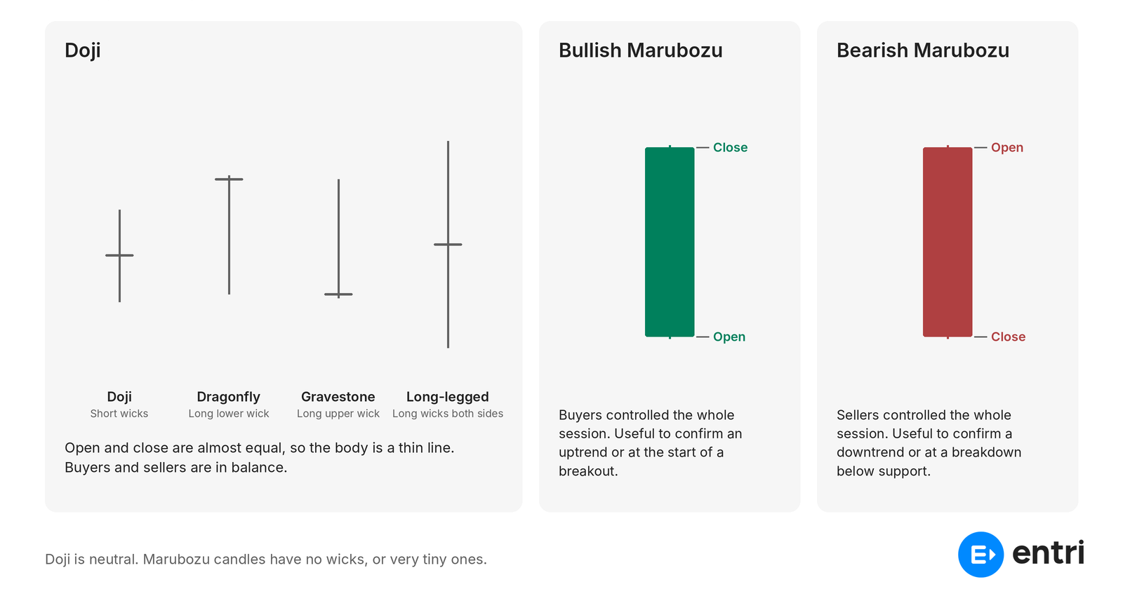
- Open and close are almost equal, so the body is a thin line. Wicks can be short or long.
- Buyers and sellers are in balance. The market is undecided. It is useful after a strong trend, as an early warning that it may slow down.
Example: A stock opens at ₹1,000, moves between ₹985 and ₹1,015, and closes at ₹1,001.
Common variations:
- Dragonfly doji (long lower wick)
- Gravestone doji (long upper wick)
- Long-legged doji (long wicks on both sides)
Bullish Marubozu
- A long green body with no wicks, or very tiny ones. Open is near the low, close is near the high.
- Buyers controlled the whole session. It is useful at the start of a breakout, or to confirm an uptrend continues.
Example: A stock opens at ₹150 (the day’s low) and closes at ₹162 (the day’s high).
Bearish Marubozu
- A long red body with no wicks, or very tiny ones. Open is near the high, close is near the low.
- Sellers controlled the whole session. It is useful at a breakdown below support, or to confirm a downtrend continues.
Example: A stock opens at ₹90 (the day’s high) and closes at ₹82 (the day’s low).
Candlestick Patterns Comparison
| Pattern | No. of candles | Bias | What it suggests |
| Hammer | 1 | Bullish | Sellers rejected |
| Inverted Hammer | 1 | Bullish | Selling weakening |
| Bullish Engulfing | 2 | Bullish | Buyers take over |
| Piercing Line | 2 | Bullish | Strong recovery |
| Tweezer Bottom | 2 | Bullish | Floor holding |
| Morning Star | 3 | Bullish | Downtrend may end |
| Three White Soldiers | 3 | Bullish | Steady buying |
| Shooting Star | 1 | Bearish | Buyers rejected |
| Bearish Engulfing | 2 | Bearish | Sellers take over |
| Dark Cloud Cover | 2 | Bearish | Strong selloff |
| Tweezer Top | 2 | Bearish | Ceiling holding |
| Evening Star | 3 | Bearish | Uptrend may end |
| Three Black Crows | 3 | Bearish | Steady selling |
| Doji | 1 | Neutral | Indecision |
| Bullish Marubozu | 1 | Bullish | Full buyer control |
| Bearish Marubozu | 1 | Bearish | Full seller control |
A Simple Example
Let’s go through the example of a stock that opens the day at ₹100. During the day, it moves up to ₹108. Later it dips to ₹98, and finally closes at ₹105.
- Open: ₹100
- High: ₹108
- Low: ₹98
- Close: ₹105
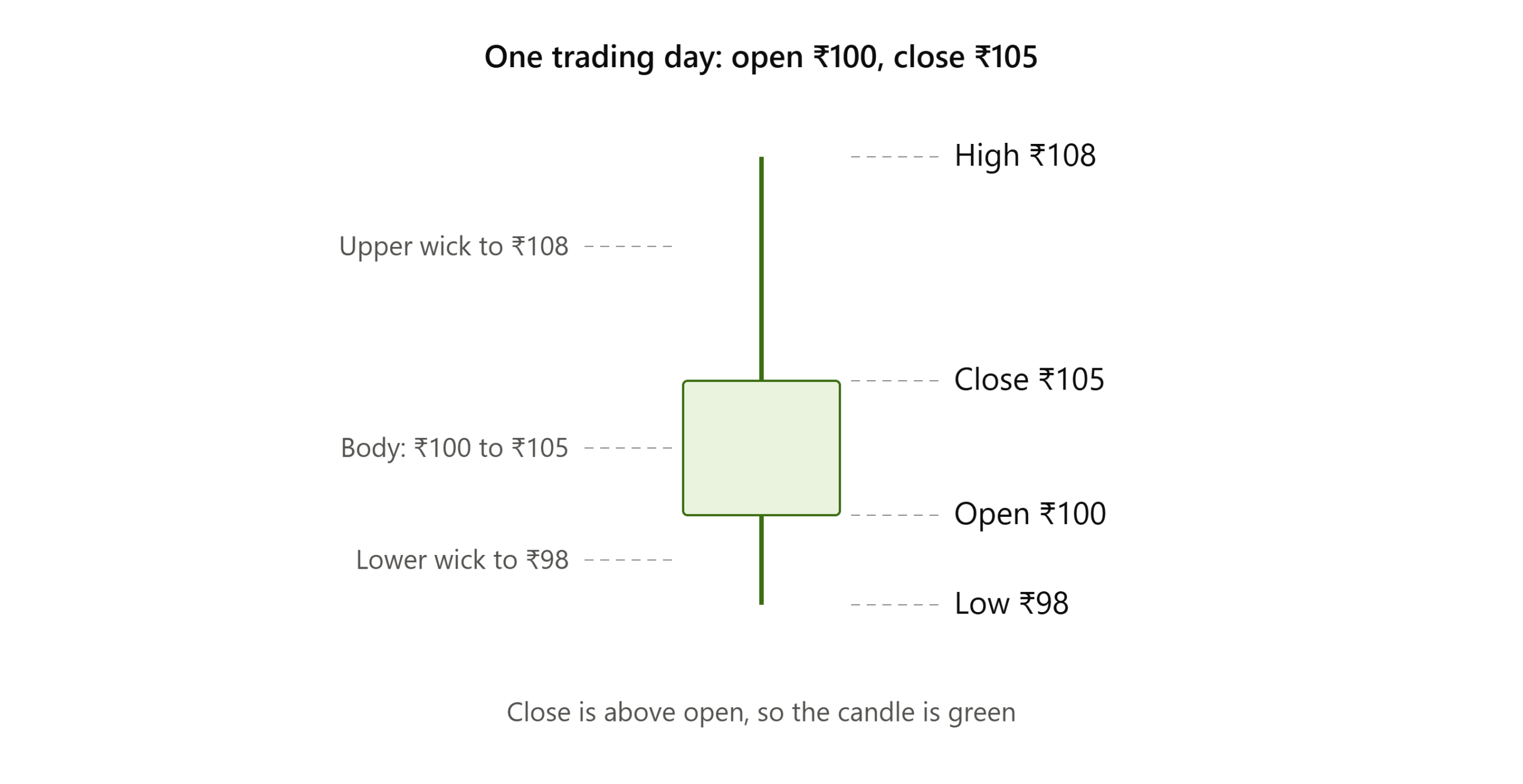 Since the close (₹105) is higher than the open (₹100), this candle would be shown in green, with the body stretching from ₹100 to ₹105, and wicks extending to ₹108 and ₹98.
What Mistakes do Beginners Make with Candlestick Patterns?
- Trading every pattern
Patterns appear all the time. Most are noise. Only act when trend, level and confirmation agree.
- Ignoring the trend
A bullish pattern inside a strong downtrend often fails. Context comes first.
- Skipping support and resistance
A pattern at a key level carries far more weight than one in empty space.
- Expecting guaranteed results
No pattern works every time. Patterns show probability, not certainty.
- Overtrading or using high leverage on one signal
Leverage (borrowed money, common in F&O and intraday) multiplies losses too. Always decide your stop-loss before entering.
|
Also Read |
|
| Types of Market Structure | |
| Types of Candlestick Patterns | |
| What is Leverage and Margin Trading | |
