
Table of Contents
The user experience is becoming a crucial market differentiation for organizations looking to distinguish out from the competition as websites and apps vie for users’ attention. When a platform provides a subpar experience, users quickly switch to another that provide the same service in a more straightforward, efficient, or user-friendly manner. Businesses are becoming more and more aware that if usability, accessibility, and functionality are not given first priority, even the most inventive and exquisitely designed apps and websites may not succeed.
Continue reading to make sure your app or website satisfies the expectations of your users. The most frequent UI and UX design errors that impair usability, irritate users, and keep you from offering the best possible user experience are listed in this article. We’ll discuss the mistakes that can jeopardize the success of your project and offer concise, doable advice on how to prevent them, ranging from disregarding user research to having a bad visual hierarchy.
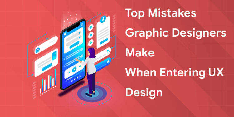
Top Mistakes Graphic Designers Make When Entering UX Design
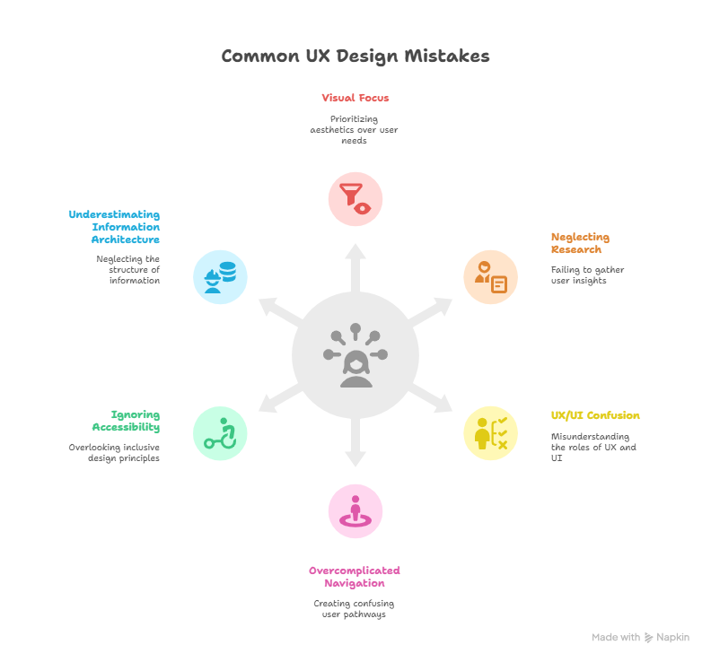
1. Focusing Too Much on Visuals Instead of User Experience
The Mistake: Because they are used to producing aesthetically pleasing designs, graphic designers might put aesthetics ahead of user experience (UX) without taking into account how users will engage with the product or service.
The Problem: This may result in a product that is lovely but useless, making it difficult for people to navigate, locate information, or finish activities.
The Solution: Through user research and testing, designers must refocus their attention on comprehending consumer demands and behaviors. They should put usability and functionality first, making sure the design accomplishes its goal.
2. Neglecting User Research and Testing
The problem is that this results in designs that are more predicated on conjecture than on real user insights, which may produce goods that don’t appeal to the intended market.
The solution is to include user research from the outset of the design process. To learn about the needs, preferences, and pain areas of users, conduct usability testing, surveys, and interviews.
3. Confusing UX with UI Design
A user’s path to address a particular problem is the focus of user experience, whereas the appearance and functionality of a product’s surface are the focus of user interface.
User experience focuses on both on and off the screen, and on anything that will have an impact on the user’s journey, whether that impact be positive or negative. Conversely, the user interface will primarily concentrate on the appearance and functionality of the product’s surface.
While the user interface designer’s duty is to concentrate more on practical components of the process, the user experience designer is primarily concerned with the conceptual aspects.
A user experience designer is skilled in information architecture, research, and strategy. In contrast, the user interface designer concentrated on issues like motion design, brand, and information design.
While the user experience is about the entire experience and not just the screen, the user interface is about the information and visual design surrounding the screens.
The field of user experience design is vast and growing in popularity every day. Nowadays, many businesses that create goods or render services—not just those with an online presence—are realizing the need of knowing their customers and testing their theories before moving forward.
Well, user interfaces are the sole purpose of user interface design. This does not imply that it is exclusive to mobile devices, tablets, and computer graphical user interfaces. These days, interfaces can also be found on a wide range of other products, including watches, ticket kiosks, vending machines, washing machines, dashboards for cars, and many more.
4. Overcomplicating Navigation
The mistake:
In UI and UX design, it’s all too easy to make navigation overly complicated. Designers may wind up making their navigation excessively feature-rich, providing a bewildering array of options, categories, or menus, in an attempt to provide users with a variety of options and experiences.
Even with the best of intentions, this frequently leads to a cluttered page and an unclear user experience. Users leave the site or app feeling overloaded and having failed to accomplish their goals.
Users may find too sophisticated navigation unpleasant in addition to annoying. Prioritizing a trendy layout or design aspect may seem spectacular at first, but consumers will quickly switch to a competitor’s site or app that is easier to use if it is impeding accessibility and usability.
How to stay away from it
If there was ever a need to keep things straightforward, this is it.
Don’t add anything that isn’t absolutely necessary because you want users to find the navigation intuitive. Rather, concentrate on the crucial actions and material that users require.
Then, limit the number of options available to consumers at each level by arranging these components in a sensible order. Additionally, to lessen cognitive burden, make an effort to maintain patterns that are recognizable and constant. Make use of intuitive symbols, breadcrumbs, and clear menus; consistently place minor components in the same spot on the page.
The success of your on-screen navigation will be greatly influenced by user testing, which will tell you how to best direct people to their destination. It’s a good idea to run usability testing to find any areas that could want simplification and to find navigational pain points.
Lastly, think about adding a search feature to assist users in quickly locating particular material.
5. Ignoring Accessibility and Inclusive Design
Ignoring accessibility is one of the largest and most often UX mistakes. A significant portion of your audience is inadvertently prevented from taking full advantage of what you have to offer when user interfaces fail to take into account individuals with impairments or various needs.
Accessibility is more than just abiding by the regulations. It all comes down to making your services accessible to all. Being exclusive can restrict your audience, damage the reputation of your company, and lower user engagement levels. The slightest adjustments can have a profound impact.
Here are some strategies to surpass that:
- Observe the WCAG guidelines: For improved usability, make sure your design complies with accessibility guidelines.
- Use alt text to improve SEO and make sure your photographs are described for people who are blind or visually challenged.
- Make sure the contrast is high: Verify that individuals with vision impairments can read the text.
- Use assistive technology to test: Use keyboard navigation and screen readers to find problems.
- Enable keyboard navigation: Verify that every interactive element works without a mouse.
6. Underestimating the Importance of Information Architecture
- The practice of organizing and arranging data to facilitate user comprehension and discovery is known as information architecture, or IA.
- Whether building services for the real world or for the World Wide Web, it is a crucial component of any user experience design process.
- A well-designed information architecture improves user experience and shows how much a business cares about its audience’s or customers’ experience.
- Knowing your consumers, auditing your material, using short, straightforward language, simplifying your architecture, ensuring that users are aware of their location, utilizing familiar patterns, and establishing consistency are all crucial components of a strong information architecture.
An essential component of any digital product is information architecture. Undervaluing it can have a number of detrimental effects, ranging from decreased productivity and user annoyance to detrimental effects on corporate objectives. Making IA a top priority guarantees a user-friendly experience, which eventually helps businesses succeed.
7. Not Collaborating Effectively with Developers and Stakeholders
In UX projects, cross-team communication is essential because it guarantees team alignment, cultivates a common understanding of user demands, and eventually improves user experience and product design. A more comprehensive and user-centric approach to product development is made possible by efficient communication between UX designers and other teams, such as engineering, product, and marketing.
Tips for Graphic Designers Transitioning to UX Design
Frequently Asked Questions
Why is accessibility crucial in UI/UX design?
Accessibility ensures that all users, including those with disabilities, can use your product effectively. Accessible design broadens your audience and is essential for creating an inclusive experience that meets both user and legal standards.
What are the most common mistakes in UI/UX design?
The most common mistakes include ignoring user research, poor navigation structure, overloading users with information, lack of responsiveness, and inconsistent design elements. These errors can lead to frustration and a lack of engagement from users.
Why is consistency so important in UI/UX design?
Consistency helps users learn and predict interactions within your product, enhancing usability and trust. A consistent style in colors, buttons, and typography across the interface provides a smooth, intuitive experience.


