
Table of Contents
In the world of fashion design, color is more than simply something that comes across as attractive; it is also a means of expressing oneself, establishing trends, and making things seem gorgeous. You just need to understand how to make colors work together and shine out at the same time if you want to transform a decent outfit into an incredible piece of art. understand how to do this. If you are an enthusiastic fashion designer who is interested in learning all there is to know about color theory, then this book is for you.
Start Your Fashion Journey Today! Learn Advanced Designing & Boutique Skills with Experts!
What Is Color Theory in Fashion Designing?
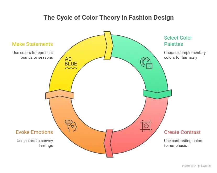
In the realm of fashion design, the study of how colors interact with one another, how they are perceived, and how they are perceived is referred to as color theory. They are provided with a framework that enables students to construct ensembles that are consistent, convey feelings via color, and create combinations that are visually appealing. With an understanding of color theory, designers are able to do the following:
- When you want to make your garments seem better overall, select color palettes that are complementary to one another.
- Make use of colors that are complementary to one another in order to generate contrast or call attention to certain aspects.
- Feelings such as friendliness, tranquility, excitement, or elegance may be evoked successfully.
- If you keep to a color scheme, you may make a statement about your firm or about the changing of the seasons.
The purpose of color theory is to aid designers in making purposeful judgments that raise clothing from the level of basic fabric to that of an aesthetically fascinating and emotionally engaging piece of art. This is why color theory is an essential component of the fashion industry (fashion business).
Understanding the Color Wheel
A number of colors are represented on the wheel, including:
- Yellow, blue, and red are the three primary colors for this year. The primary colors that cannot be created by mixing additional colors are listed below.
- The hues orange, green, and purple are considered to be secondary colors. They are created by combining two primary colors into a single hue.
- The process of mixing a primary color with a secondary color that is next to it results in the formation of tertiary colors.. Red-orange or blue-green are two examples of such colors.
The color wheel is a tool that has been used by fashion designers in order to produce color combinations that are visually appealing and look well together. Within the realm of fashion, some of its most prominent uses include the following:
- On the color wheel, complementary colors are hues that are opposite each other. When you want to create designs that stand out and are simple to perceive, you should choose complimentary colors. As an example, the colors blue and orange.
- A peaceful and harmonious effect may be achieved by the use of colors that seem to be similar to one another. These colors include green, yellow-green, and yellow.
- An appearance that is sophisticated and harmonious may be achieved by using monochromatic hues, which are characterized by the use of varying tones of the same color.
- On the color wheel, the hues red, blue, and yellow are referred to be triadic colors since they are equally aligned alongside one another. The patterns that they produce are not only vibrant but also well-balanced.
Master Fashion Designing and Create Your Signature Style
Unlock your creative potential with our expert-led Fashion Designing course. Build in-demand skills and step confidently into the world of fashion!
Begin Your Fashion Career Today!Primary, Secondary & Tertiary Colors
To put it simply, knowing how to classify colors is crucial for any fashion designer who wants to create clothes that stand out. To aid in the process of creating harmonious collections, the color wheel categorizes colors as either primary, secondary, or tertiary.
Primary colors
The primary colors are the source from which all other colors are generated. There is no way to create them by blending colors of various hues. These colors are used extensively in the fashion business, whether they are used as a core hue or as a piece that stands out.
Red: Red is a hue that captures the essence of life, excitement, and concentration.
Blue: Blue is a color that symbolizes trust, knowledge, and tranquility.
Yellow: It is often believed that yellow is connected with happiness, warmth, and optimism.
Secondary colors
A secondary color is produced when two main colors are combined into a single color. As a result of their ability to make fashion designs more intriguing and complicated, they are often used in conjunction with primary colors.
- When blue and yellow are combined, the result is green. Both nature and freshness are represented by it.
- The mixture of red and yellow is known as orange. Both vigor and ingenuity are shown by it.
- As a color, purple is composed of red and blue. It represents riches, elegance, and a sense of mystery.
Tertiary colors
The creation of a third color is accomplished by combining a primary color with a secondary color that is next to it. Due to the fact that these hues are more intricate and understated, manufacturers may employ them to create even more delicate products when they use them.
- The combinations of red and orange, yellow and green, blue and purple, and others are included in this category.
- When creating gradients, layering, or subtle distinctions, the fashion industry often makes use of tertiary colors.
Warm Colors vs Cool Colors
Colors in the fashion industry not only have an aesthetic purpose, but they also have the ability to communicate feelings and states of mind. The classification of colors according to temperature, sometimes known as warm and cold, is one of the most significant ways. When designers are aware of this difference, they are able to choose colors that not only match the characteristics of the wearer but also evoke the feelings that they want to be evoked.
Warm colors
When we think of warm colors, we think of vitality, warmth, and brightness. Warm colors are connected with these things. In the realm of fashion design, they have a wide range of applications, ranging from attracting people’s attention to making them feel at ease or enthusiastic inside themselves.
E.g., red, orange, and yellow, in addition to a great number of other permutations of these colors
People are more likely to experience feelings of coziness, enthusiasm, energization, and excitement when they expose themselves to warm hues.
Applications:
- Garments, outerwear, and accessories that are fashionable and demand attention
- Collections that are tailored according to the seasons, particularly those that include summer or festive wardrobe essentials
- By blending or layering with neutral tones, you may be able to produce a picture that is more balanced.
Cold colors
The mix of cold hues elicits sentiments of calm and refined elegance in the viewer. The use may result in the creation of a variety of styles, including businesslike, elegant, and unhurried.
- To name just a few examples, there is a large range of colors, including blue, green, and purple.
- When seen from a psychological point of view, the color cold is linked to emotions of safety, calm, and equilibrium.
Uses of Fashion in Everyday Life That Are Practical:
- Business attire appropriate for the workplace
- For formal events, there are some very stunning gowns and costumes.
- Adding layers of warm colors to your design is something you should think about doing, whether you want to achieve harmony or contrast.
Start Your Fashion Journey Today! Learn Advanced Designing & Boutique Skills with Experts!
Color Harmony & Color Combinations
When it comes to fashion design, picking colors that complement one another is just as crucial as selecting colors specifically for use in the garment. Wearing ensembles that are visually attractive, balanced, and transmit the intended mood is made possible via the use of color harmony. It is possible for designers to produce designs that are stunning, beautiful, or subtle by using the principles of color harmony. These designs will connect with their audience.
What Is Color Harmony?
A harmonious combination of colors is achieved when the colors are arranged in a manner that is visually appealing. It ensures that the overall design is harmonious and avoids conflicts from occurring from occurring. Combinations of colors that are harmonious assist to highlight the style, form, and mood of the clothing, while also improving the look of the person wearing it.
Common color combinations include the following:
- Complementary Colors: Use opposite colors like blue and orange to create beautiful patterns with contrast.
- Analogous Colors: Use comparable yellow, yellow-green, and green for a pleasing look.
- Monochromatic Colors: Use many shades of the same color for a seamless look.
- Triadic Colors: Red, blue, and yellow are equally dispersed on the color wheel, making them ideal for lively and harmonious designs.
Start Your Fashion Journey Today! Learn Advanced Designing & Boutique Skills with Experts!
Master Fashion Designing and Create Your Signature Style
Unlock your creative potential with our expert-led Fashion Designing course. Build in-demand skills and step confidently into the world of fashion!
Begin Your Fashion Career Today!Conclusion
Color’s significance in fashion design cannot be overstated because it has an effect on the entire feel, beauty, and utility of an outfit. Through the study of the color wheel, warm and cool tones, and primary, secondary, and tertiary colors, designers have the ability to create color schemes that are both visually appealing and harmonious. Having mastered the art of color harmony and the psychology of color matching, designers are able to take simple clothing and convert it into works of beauty. This is possible because of the ability to create a harmonious color scheme.
Master Fashion Designing and Create Your Signature Style
Unlock your creative potential with our expert-led Fashion Designing course. Build in-demand skills and step confidently into the world of fashion!
Begin Your Fashion Career Today!Frequently Asked Questions
Why is understanding the color wheel important in fashion?
The color wheel helps designers see relationships between colors, making it easier to create balanced, complementary, or contrasting combinations.
How do warm and cool colors affect fashion designs?
Warm colors (red, orange, yellow) create energy and attention, while cool colors (blue, green, purple) evoke calmness and sophistication.
Can warm and cool colors be combined in one outfit?
Yes, combining warm and cool colors strategically creates contrast and balance, adding depth and interest to a design.
How can beginners apply color theory in fashion designing?
Start by experimenting with small color palettes, using the color wheel as a guide, and observing how different combinations affect the look and feel of garments.
How do designers use color harmony?
Designers use color harmony to combine colors in ways that are visually pleasing, using schemes like complementary, analogous, monochromatic, or triadic colors.


