

Table of Contents
UI/UX case studies are more than design showcases—they are our roadmaps for building better digital products. They reveal the thinking, strategy, and iteration behind the interfaces that millions use every day. If you’re trying to improve your product’s design or studying how top companies solve real problems through UI/UX, then this article will help you.
UI/UX Case Studies: How Top Companies Design Winning Products
Introduction
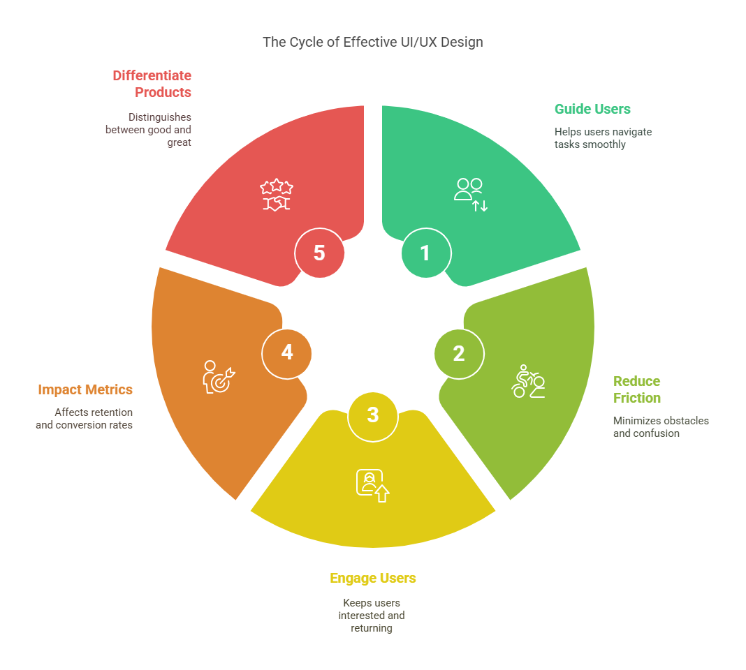
Design isn’t decoration—it’s a product’s backbone. Great UI/UX turns casual users into loyal fans.
-
It guides users effortlessly through complex tasks
-
It reduces friction and confusion
-
It keeps people engaged, coming back, and sharing
-
It’s the reason some apps feel intuitive—and others don’t
-
It directly impacts retention, conversion, and satisfaction
-
It separates good products from great ones
Want to build products people love? Learn from those who’ve already done it right.
Get Certified in UI/UX Design — Build User-Friendly Experiences with Confidence!
What Makes a Great UI/UX Case Study?
A strong case study doesn’t just show off the final design—it tells the story of why and how the decisions were made.
1. Clear Problem Definition
-
What wasn’t working for users?
-
What goals did the team set?
2. User-Centered Research
-
Surveys, interviews, usability testing
-
Real user pain points uncovered
3. Process Breakdown
-
Step-by-step workflow: from ideation to launch
-
Tools used: Figma, Sketch, etc.
-
Key iterations or pivots
4. Design Decisions Explained
-
Why certain layouts, flows, or visuals were chosen
-
Trade-offs or constraints addressed
5. Before & After Screens
-
Visual evolution of the product
-
Highlights UI changes and experience upgrades
6. Impact Metrics
-
What improved? (e.g., engagement, task success, drop-off rates)
-
Quantitative + qualitative results
7. Lessons Learned
-
What worked well
-
What didn’t—and how it was fixed
Given below table is a quick-reference summary of the key elements that make a great UI/UX case study
UI/UX Case Studies: Quick Reference Table
| Element | Why It Matters | Example |
|---|---|---|
| Problem Definition | Gives context and focus | “Users dropped off at checkout.” |
| User Research | Builds empathy and direction | “80% found signup too complex.” |
| Process Breakdown | Shows how the team approached solving the problem | “Used Figma to prototype 3 flows.” |
| Design Decisions | Highlights thoughtful UX choices | “Chose tabs over dropdowns.” |
| Visual Comparisons | Makes evolution clear and compelling | “Old vs. new onboarding screens.” |
| Measurable Results | Proves the redesign was effective | “+25% retention post-launch.” |
| Key Takeaways | Shares insights that others can use | “Early testing saved weeks later.” |
UI/UX Case Studies: Deep-Dive Case Studies of Brands
1. Airbnb – Simplifying the Search Experience
The Problem:
-
Too many filters confused users
-
Listings lacked visual clarity
-
Booking flow felt overwhelming
What They Did:
-
Grouped filters by travel context (e.g., family, remote work)
-
Enhanced search map interaction
-
Improved listing card previews with clearer info
Design Choices:
-
Prioritized whitespace and visual hierarchy
-
Used icons to support quick scanning
-
Made CTAs more prominent
Impact:
-
Increased conversion on search-to-book
-
Shorter user time to find desired listings
-
Reduced bounce rate on search results
Takeaway:
Simplify complex choices without removing control. Show only what matters at the right time.
2. Duolingo – Gamification That Works
The Problem:
-
Users lost motivation over time
-
Lessons felt repetitive and flat
-
Retention dropped after first few sessions
What They Did:
-
Introduced streaks and daily goals
-
Added XP, levels, and leagues
-
Made UI playful and mascot-driven
Design Choices:
-
Bright, colorful visuals to reduce friction
-
Microinteractions for rewards
-
Progress bars and animations for feedback
Impact:
-
Boosted daily active users
-
Higher retention over 30-day periods
-
Built habit-forming behavior
Takeaway:
Turn routine into reward. Make learning feel like progress, not pressure.
3. Spotify – Personalized Discovery
The Problem:
-
Users overwhelmed by choice
-
Low discovery of new music
-
Engagement dipped after finding favorites
What They Did:
-
Launched “Discover Weekly” & “Daily Mix”
-
Integrated personalization into home UI
-
Created end-of-year “Wrapped” feature
Design Choices:
-
Card-based UI for scannability
-
Personalized copy (“Made for You”)
-
Smooth transitions and visual rhythm
Impact:
-
Users explored more music regularly
-
Wrapped became a viral social event
-
Increased listening time per user
Takeaway:
Make the product feel like it knows the user. Anticipate their taste.
4. Slack – Reducing Friction in Communication
The Problem:
-
Traditional tools felt formal, slow
-
Users missed important info in noisy threads
-
Switching tools hurt workflow
What They Did:
-
Designed a chat-first UI with channels
-
Introduced emoji reactions and threads
-
Added smart notifications and search
Design Choices:
-
Used informal, friendly tone
-
Added playful details (e.g., loading messages)
-
Focused on clarity over complexity
Impact:
-
Became a go-to for remote teams
-
Cut down email use dramatically
-
Increased team responsiveness
Takeaway:
Make work communication feel more human and less mechanical.
5. Canva – Design for Non-Designers
The Problem:
-
Graphic design tools were complex
-
Non-designers felt intimidated
-
Most options had a steep learning curve
What They Did:
-
Drag-and-drop interface for anyone
-
Templates for every use case
-
Easy-to-share, easy-to-edit designs
Design Choices:
-
Clean toolbar with minimal icons
-
Guided flows for common tasks
-
Real-time collaboration added
Impact:
-
Millions of users from all backgrounds
-
Widely adopted by students, marketers, educators
-
Made design accessible at scale
Takeaway:
Empower users by removing complexity.
6. Instagram – Creating a Scroll-First Experience
The Problem:
-
Photo-sharing apps were clunky
-
Uploading and editing felt slow
-
Engagement dropped off outside the feed
What They Did:
-
Focused on a fast, vertical-scroll feed
-
Added filters with one-tap previews
-
Integrated Stories and Reels for quick sharing
Design Choices:
-
Minimal interface for content-first feel
-
Easy gesture-based actions
-
Seamless transitions between features
Impact:
-
Extremely high daily usage
-
Stories and Reels reshaped the content game
-
Set the standard for mobile UX
Takeaway:
Let content lead. Build UI around speed and flow.
7. Netflix – Seamless, Smart Browsing
The Problem:
-
Users spent too long deciding what to watch
-
Too many categories and low engagement with them
-
Recommender system wasn’t user-facing
What They Did:
-
Personalized rows like “Because You Watched…”
-
Preview auto-play on hover
-
Smart search with trending content
Design Choices:
-
Dark UI for long-form viewing
-
Horizontal carousels with large thumbnails
-
Smooth cross-device syncing
Impact:
-
Reduced drop-offs on home screen
-
More content discovery
-
Higher binge rates
Takeaway:
Design for low-effort decisions and binge behavior.
UI/UX Case Studies: Common UI/UX Lessons from These Case Studies
Across all these brands, a few patterns repeat—regardless of industry, audience, or product type. These aren’t trends—they’re principles that consistently lead to better user experiences.
Summary Table: Key UI/UX Lessons from Top Brands
| Lesson | Why It Works | Examples from Case Studies |
|---|---|---|
| 1. Start with Real Problems | Solving actual user pain ensures relevance and value | – Airbnb simplified filter overload – Duolingo tackled motivation drops |
| 2. Reduce Friction | A smoother flow keeps users engaged and reduces drop-offs | – Slack’s streamlined chat – Canva’s drag-and-drop ease-of-use |
| 3. Personalize the Experience | Tailored content increases satisfaction and retention | – Spotify’s Discover Weekly – Netflix’s “Because You Watched…” rows |
| 4. Make Feedback Instant | Real-time visual or audio feedback boosts clarity and confidence | – Duolingo rewards progress instantly – Instagram’s like animation |
| 5. Use Visual Hierarchy | Directs attention and simplifies complex interfaces | – Airbnb’s listing previews – Canva’s tool layout |
| 6. Design for Emotion | Joy, fun, or delight creates emotional stickiness | – Duolingo’s playful owl – Slack’s friendly tone and loading messages |
| 7. Guide, Don’t Overwhelm | Reduce cognitive load with thoughtful pacing and smart defaults | – Netflix’s limited options per screen – Instagram’s scroll-focused feed |
| 8. Test and Iterate | Continuous feedback leads to better, data-backed design decisions | – Spotify refining UI via usage data – Slack’s evolving feature set |
UI/UX Case Studies: How to Apply These Strategies
You don’t need to be a billion-dollar brand to use smart UI/UX strategies. Here’s how to apply the same thinking to your product—whether you’re solo or scaling.
1. Identify Real User Problems First
-
Talk to users regularly – Use surveys, interviews, and direct feedback.
-
Look for drop-off points – Analyze where users abandon flows.
-
Map pain to goals – Align design fixes to what users actually want.
2. Simplify Your Core Flows
-
Audit your current UX – Find steps that feel unnecessary or clunky.
-
Prioritize ease over features – Streamline before you scale.
-
Use progressive disclosure – Show only what’s needed, when it’s needed.
3. Add Personalization Where It Counts
-
Use behavior-based content – Show what users recently did or liked.
-
Name things for the user – E.g., “Your Dashboard” or “Made for You.”
-
Adapt the UI to usage – Let frequent users skip intros or tours.
4. Design for Feedback and Flow
-
Use microinteractions – Confirm user actions visually (e.g., button tap).
-
Show loading states – Always let users know something is happening.
-
Reward actions instantly – Think: confetti, checkmarks, sounds.
5. Make It Emotionally Engaging
-
Use tone intentionally – Casual? Confident? Friendly? Make it consistent.
-
Add delight in small places – Empty states, 404 pages, success screens.
-
Visuals matter – Color, iconography, and animation set the mood.
6. Test Early, Iterate Often
-
Prototype before building – Use Figma, Adobe XD, or even paper.
-
Get feedback fast – Show designs to users, not just the team.
-
Track and tweak – Use analytics to refine based on real usage.
7. Balance Innovation with Familiarity
-
Don’t reinvent basic patterns – Users expect certain behaviors (e.g., hamburger menus, back buttons).
-
Innovate in the right places – Save creativity for key moments (e.g., onboarding, feedback, or content discovery).
-
Keep accessibility in mind – Good UX works for everyone.
Get Certified in UI/UX Design — Build User-Friendly Experiences with Confidence!
UI/UX Case Studies: Final Verdict
Great UI/UX isn’t about flashy visuals—it’s about solving real problems simply. The best products feel easy, personal, and intuitive because they’re designed with intention. These case studies prove that smart, user-centered design drives engagement and loyalty.
Key Takeaways
-
Start with user pain, not assumptions
-
Cut clutter and reduce friction
-
Personalize wherever it adds value
-
Reward actions with instant feedback
-
Keep copy clear and helpful
-
Use emotion to create connection
-
Stick to familiar patterns
-
Test early, refine constantly
-
Design for flow, not just screens
-
Prioritize accessibility for all users
| Related Links | |
| UI vs. UX Design: Key Differences, Roles, and Which to Learn in 2025 | Ultimate Guide to the Best UI/UX Design Tools in 2025 |
| How to Become a UI/UX Designer: A Step-by-Step Roadmap | |
Frequently Asked Questions
Why are UI/UX case studies important to study?
UI/UX case studies give you a behind-the-scenes look at how successful products are built and improved. They reveal the design process, user problems, decisions made, and results achieved. By studying them, you can learn proven strategies, avoid common mistakes, and apply real-world techniques to your own product design.
What makes a UI/UX case study different from a regular product overview?
A case study dives deeper. It doesn’t just show what was built—it explains why it was built, how it was done, and what the impact was. A good UI/UX case study includes user problems, research insights, iterations, challenges faced, and final outcomes. It’s about the journey, not just the final screen.
How do top brands consistently get UX right?
Top brands stay close to their users. They invest heavily in research, usability testing, and data analysis. They iterate constantly, test ideas early, and involve designers throughout the product lifecycle. Most importantly, they treat design as a core business function—not an add-on.
Can smaller teams apply the same strategies used by companies like Spotify or Airbnb?
Absolutely. While large companies have more resources, the core principles—like solving real user problems, reducing friction, and adding value through personalization—can be applied by teams of any size. Even with limited tools, you can run usability tests, simplify flows, and prioritize user needs.
What’s the biggest UI/UX mistake companies make?
One of the most common mistakes is designing for aesthetics over usability. A product can look great but still confuse or frustrate users. Another big one is skipping user research—assuming you know what users want without actually asking them or observing real behavior.
How often should you update your UI/UX design?
There’s no fixed rule, but you should update your design based on user behavior, feedback, and performance data. If users are dropping off, getting stuck, or not engaging, it’s time to rethink the experience. Even successful products should evolve to keep up with new expectations and tech.
What tools do companies use to improve UI/UX?
Some of the most common tools include:
-
Figma / Adobe XD – for prototyping and design
-
Hotjar / FullStory – for session recording and heatmaps
-
Google Analytics / Mixpanel – for user behavior tracking
-
UserTesting / Maze – for usability testing
-
Surveys and interviews – for direct user feedback
What matters more than the tool is having a process for continuous learning and iteration.
What’s the difference between good UX and great UX?
Good UX solves a problem efficiently. Great UX does that and creates an emotional connection. It feels effortless, thoughtful, and sometimes even delightful. Great UX anticipates user needs, guides them naturally, and leaves a lasting impression that makes users want to return.
How can I tell if my product has UX issues?
Start by asking:
-
Are users dropping off at key points?
-
Do you get repeated support questions about the same issues?
-
Are users confused or stuck during onboarding?
-
Is engagement lower than expected?
Watching real users interact with your product (even 5–10 people) can surface friction points quickly.
Where can I find more great UI/UX case studies to learn from?
Some great resources include:
-
Medium (UX Collective, Bootcamp, Case Study Club)
-
Behance and Dribbble portfolios with real projects
-
Company design blogs (e.g., Airbnb, Dropbox, Spotify, Shopify)
-
Design newsletters and YouTube UX breakdowns
Look for case studies that show process, not just pretty screens.


