

Table of Contents
Are you a beginner who is clueless about how to read stock charts? There’s absolutely no need to worry as we have the answers for all your questions. If you are curious to learn further about all these aspects, read this blog till the end.
Key Takeaways
- Stock charts are visual tools that show the price history and trading activity of the shares of a company.
- Candlestick charts are the most popular format in India as they offer detailed data on opening, closing, high, and low prices.
- Identifying trends such as Uptrend, Downtrend, Sideways etc. is the first step toward successful market analysis.
- Support and Resistance levels act as “floors” and “ceilings” for price movements, which helps you spot entry and exit points.
- Volume acts as a confirmation tool and a price move with high volume is generally more reliable.
Introduction
1: What is a stock?
If you have ever opened a trading app or watched a financial news channel, you have likely seen jagged lines and colorful bars dancing across the screen. To a newcomer, these can look like a complicated heartbeat monitor. However, as an investor in the Indian market, learning how to read stock charts would be one of the most empowering skills you can acquire.
To start with, think of a stock chart as a storybook. Instead of words, it uses visual patterns to tell you what buyers and sellers have been doing. By understanding these charts, you move away from “investing based on tips” to “investing based on data.” This guide will break down everything you need to know to start your journey in technical analysis.
What is a Stock Chart?
A stock chart, in simple terms, is a graphical representation of the price of a stock over a specific period. In the chart, the vertical axis i.e. Y-axis represents the price, while the horizontal axis i.e. X-axis represents time.
In India, irrespective of whether you are looking at blue-chip stocks like Reliance or mid-cap companies, the charts look the same. They help you answer three vital questions:
- What was the price in the past?
- What is the current direction of the price?
- Where might the price go next?
Charts – 3 Most Common Types

Before we go deep into the topic, you need to understand which “view” you are looking at. There are 3 main types offered by most platforms.
1. Line Charts
This is the simplest version. It connects the closing prices of a stock over a period. While it is great for seeing the overall “big picture” trend, it hides the daily drama of price fluctuations.
2. Bar Charts (OHLC)
Bar charts offer more detail as they show the Open, High, Low, and Close for each period. A small tick on the left shows the opening price whereas a tick on the right shows the closing price.
3. Candlestick Charts
This is the gold standard for Indian traders. Candlesticks are visually intuitive and tell you at a glance who won the battle. Whether it’s the bulls (buyers) or the bears (sellers).
More About Candlestick
A single “candle” represents a specific timeframe and some examples are 1 minute, 1 hour, or 1 day.
- The Body: The thick part of the candle. If the body is Green, the stock closed higher than it opened (Bullish). If it is Red, the stock closed lower (Bearish).
- The Wicks (Shadows): The thin lines above and below the body. The top tip is the highest price reached, and the bottom tip is the lowest.
When learning how to read stock charts, pay attention to the size of these candles. A long green candle suggests strong buying interest, while a candle with a tiny body and long wicks suggests the market is confused (indecision).
Stock Market Training Reviewed & Monitored by SEBI Registered Investment Advisor
Trusted, concepts to help you grow with confidence. Enroll now and learn to start investing the right way.
Know moreIdentifying Trends: The Direction of the Market
The market never moves in a straight line, but it moves in “waves.” To make money, you want to “trade with the trend.”
1. Uptrend (Bullish)
An uptrend’s main features are Higher Highs and Higher Lows. It resembles a staircase going up and in an uptrend, each time the price drops slightly, buyers pitch in to push it even higher.
2. Downtrend (Bearish)
This is marked by Lower Highs and Lower Lows. It indicates that sellers are in control, and the stock is losing value over time.
3. Sideways (Consolidation)
There are times when the price gets stuck in a range and they move horizontally. It shows that buyers and sellers are equally matched, and the market is waiting for a “trigger” to move in either direction.
Support and Resistance: The Floor and Ceiling
Understanding support and resistance is a breakthrough moment for most beginners.
- Support (The Floor): This is a price level where a falling stock tends to stop and bounce back up. It is an area where there is enough “demand” to prevent the price from falling further.
- Resistance (The Ceiling): This is a price level where a rising stock tends to face selling pressure and drop. It is an area where there is enough “supply” to stop the price from going higher.
Pro Tip: Once a stock breaks above a “Resistance” level, that old ceiling often becomes the new “Support” (floor) for the next leg up.
The Role of Volume
Many beginners ignore the bars at the very bottom of the chart. That is Volume. It shows how many shares were traded during that time.
- High Volume + Price Rise: Confirms a strong uptrend. People are putting real money behind the move.
- Low Volume + Price Rise: Be careful. This move might be “fake” or weak because very few people are participating.
If you are learning how to read stock charts, always remember: Price is the “What,” and Volume is the “How much conviction.”
Essential Indicators for Beginners

While price action is king, a few basic mathematical “indicators” can help confirm your findings.
1. Moving Averages (MA)
A Moving Average smooths out price data to create a single flowing line.
- 20-day MA: Good for short-term trends.
- 200-day MA: Used by long-term investors to see the “health” of a stock. If the price is above the 200-MA, the stock is generally considered to be in a long-term bull phase.
2. Relative Strength Index (RSI)
The RSI is a momentum indicator that ranges from 0 to 100.
- Above 70: The stock might be “Overbought” (too expensive, might drop soon).
- Below 30: The stock might be “Oversold” (too cheap, might bounce back soon).
Chart Patterns – 3 Common Ones to Watch Out
As you spend more time looking at charts, you will start seeing repeating shapes. Here are three famous ones:
1. Head and Shoulders
This looks like a central peak (Head) with two smaller peaks on either side (Shoulders). It is a reversal pattern, signaling that a long uptrend is about to end.
2. Double Bottom (The “W” Shape)
The price hits a low point twice but cannot break below it. This looks like the letter “W.” It is a bullish sign suggesting that the stock has found a strong floor and is ready to go up.
3. Triangles
Triangles form when the price range gets narrower and narrower. Eventually, the price “breaks out” or “breaks down” from the triangle with high speed.
4 Tips To Start Practicing

You don’t need to put money at risk to learn. Follow these steps:
- Open a Demo Account: Most Indian brokers provide free charting software.
- Pick a Familiar Stock: Choose a stock that you know well, such as SBI or Tata Motors.
- Check Various Timeframes: Look at the “Daily” chart for long-term trends and the “15-minute” chart to observe daily volatility.
- Draw Lines: Practice by drawing Support and Resistance lines and see if the price respects them.
Understanding how to read stock charts takes time and never expect to become an expert overnight. Start by observing and noticing how the price reacts to news and volume.
Conclusion
As you know by now, reading a stock chart is less about math. To keep it simple, it is about understanding human psychology. Every “Green” or “Red” candle stands for the collective hopes and fears of millions of investors. By mastering the basics like candlesticks, trends, support/resistance, and volume, you have a clear upperhand over those who trade blindly.
Last but not least, stay patient, keep your charts clean, and always manage your risk. Happy investing in the Indian markets!
Stock Market Training Reviewed & Monitored by SEBI Registered Investment Advisor
Trusted, concepts to help you grow with confidence. Enroll now and learn to start investing the right way.
Know moreFrequently Asked Questions
Which timeframe is best for beginners?
The Daily timeframe is best for beginners as it reduces the market noise. It also gives a clearer picture of the overall trend compared to 1-minute or 5-minute charts.
Why do some candles have no wicks?
A candle with no wicks (a Marubozu) means the stock opened at its high/low and stayed there. It shows extreme confidence by either buyers or sellers.
Are stock charts 100% accurate?
No, as charts show probabilities and not certainties. They help you make informed guesses, but unexpected news such as a sudden policy change can always override a chart pattern.
What does a "Gap Up" mean?
A “Gap Up” happens when a stock opens at a significantly higher price than it closed the previous day, usually due to positive news overnight.
Is technical analysis better than fundamental analysis?
Both have value. Fundamentals tell you what to buy (is the company good?), while technicals tell you when to buy (is the price right?).
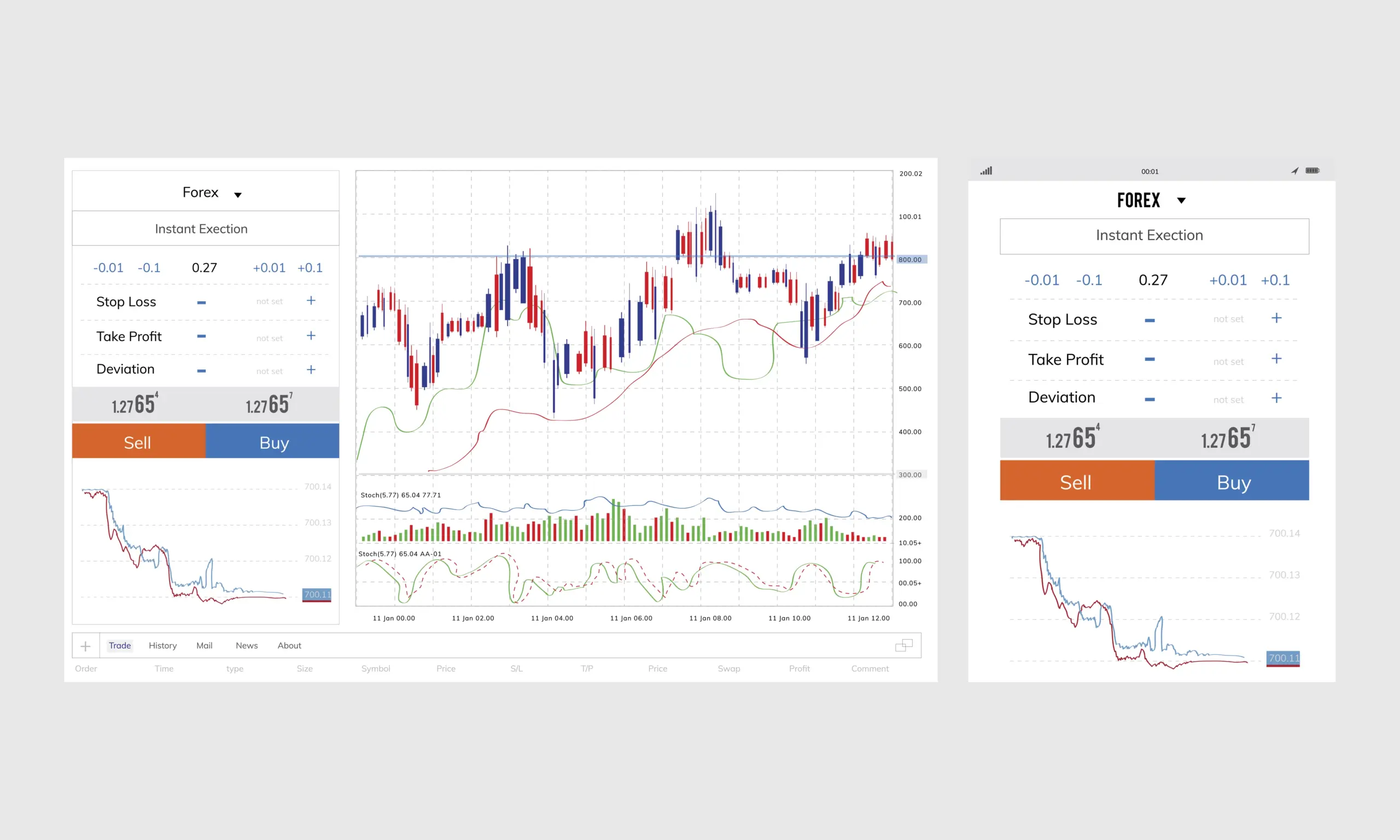
Can I read charts on my mobile phone?
Yes, most Indian trading apps have excellent charting tools. However, if you use a laptop/desktop, it becomes easier for drawing lines and detailed analysis.
Do I need to pay for charting software?
Not necessarily as most Indian brokers offer professional-grade charting tools for free when you open a demat account.


