Table of Contents
CSS Flexbox is one of the concepts of CSS programming that one must be familiar with while designing a web. Flexbox stands for the flexible box. It consists of a container and items. It is used to organize the space and create a proper layout for your projects even when the size of the items is unknown. We will be discussing the CSS Flexbox in Telugu in this article. The learning is made interesting for the learners by teaching this concept via a game. Yes, you heard it right! You will be learning how to code by playing games! So gear up and get started now!
Learn to code from industry experts! Get a free Demo here!
What is CSS Flexbox ?
CSS Flexbox is a layout model that helps arrange elements within a container flexibly. It allows you to easily control the alignment, spacing, and ordering of items along a single direction or axis. With properties like display: flex and justify-content, Flexbox helps you to create responsive and dynamic layouts in web design. It’s especially useful for building complex interfaces that can be used for different screen sizes and devices.
Basic Concept of CSS Flexbox
1: Which of the following is a JavaScript framework/library?
Flexbox is like a special tool that helps you easily arrange things on a web page. The basic concepts of CSS Flexbox include:
Flex Container:
- It’s like a box that holds other things (like pictures or text) on your web page.
- You can make any box a flex container by using a special command in CSS.
Flex Items:
- These are the things inside the flex container.
- They can move around and change size depending on how you set up the flex container.
Main Axis and Cross Axis:
- Think of it like one line going across and another line going up and down.
- The main axis is the line going across, and the cross axis is the one going up and down.
Flex Direction:
- It’s like telling the flex container which way the line should go.
- You can make things go from left to right, right to left, top to bottom, or bottom to top.
Justify Content:
- This is like telling the flex items how to spread out along the line.
- You can make them spread out evenly or stay bunched up together.
Align Items and Align Content:
- It’s like making sure the flex items sit nicely on the line.
- You can make them sit at the top, middle, or bottom of the line.
Flex:
- This is like saying how much space each flex item should take up.
- You can make some items bigger and some smaller.
Flex Wrap:
- It’s like deciding what to do if there’s not enough room on the line.
- You can make the items wrap onto the next line if they don’t fit.
Ordering:
- It’s like telling the flex items where to sit in line.
- Even if they’re written in a certain order in the code, you can change their order on the page.
🚀 Start Coding Today! Enroll Now with Easy EMI Options. 💳✨
Get Hired as a Full-Stack Developer: Master the Skills Employers Are Looking For!
Start Learning With EMI Payment OptionsCSS Flexbox Tutorial From Experts
Lets go through a small tutorial via playing a game to understand CSS Flexbox. Please follow the steps given below:
Step 1: Go to google.com and search for Flexbox Froggy.
Step 2: Click on the link flexboxfroggy.com. It is a game via which you will understand the working of Flexbox.
Step 3: Starting with level -1 complete all the steps to get the basic knowledge of CSS Flexbox commands.
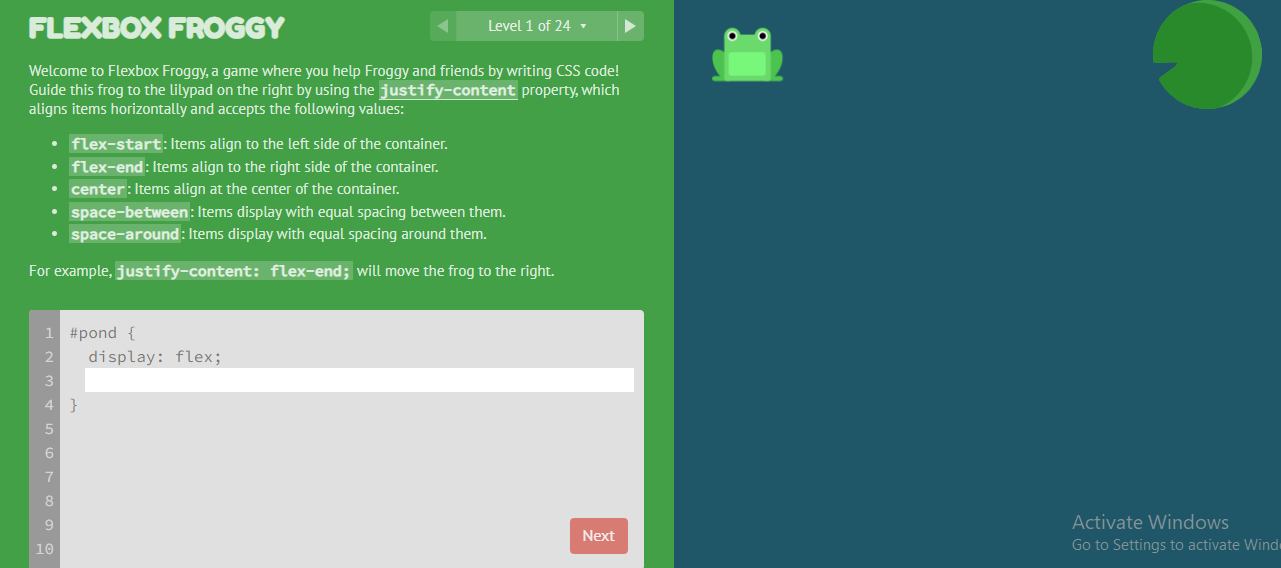
Level – 1: In this level the frog is at the left most corner of the screen and it has to reach a lily pad at the right most corner of the screen.
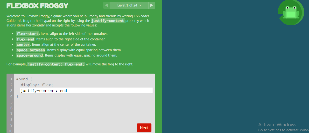
Input : Enter the command “justify-content: end.”
Output: The frog reaches the lily bad at the right end of the page.
Step 4: Click on Next at the bottom.
Step 5: Now go for level 2 challenge.
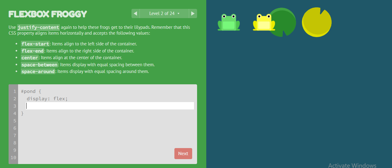
Level – 2: In this level there are two frogs and two lily pads at the center of the screen. Now we should send both the frogs to its lilly pads.
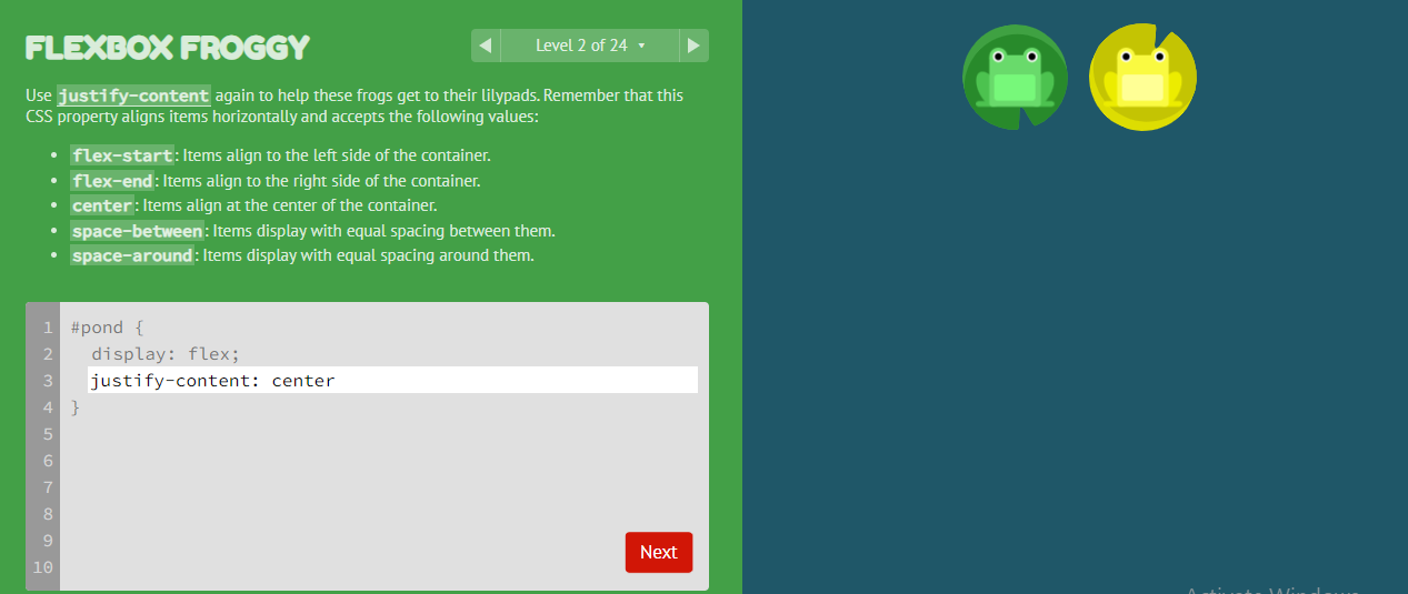
Input: Enter the command “justify-content: center”.
Output: Both the frogs reach their respective lily pads.
Step 6: Click on Next.
Step 7: This way continue from level-3 to level-4 and complete the game to get a clear understanding of all the CSS Flexbox commands.
The tutorial videos given in the next section will help you to continue.
| Trending Courses in Telugu | |
| Full stack Development Course in Telugu | Data Science and Machine Learning Course in Telugu |
CSS Flexbox in Telugu ( Tutorial from experts)
Given below is are the tutorial videos of CSS flexbox in Telugu. Click on the video link to access.
| Topic | Video |
| CSS Flexbox in Telugu – level – 1 | |
| CSS Flexbox in Telugu – level – 2 | |
| CSS Flexbox in Telugu – level – 3 | |
| CSS Flexbox in Telugu – level – 4 | |
| CSS Flexbox in Telugu – level – 5 | |
| CSS Flexbox in Telugu – level – 6 | |
| CSS Flexbox in Telugu – level – 7 | |
| CSS Flexbox in Telugu – level – 8 | |
| CSS Flexbox in Telugu – level – 9 | |
| CSS Flexbox in Telugu – level – 10 | |
| CSS Flexbox in Telugu – level – 11 |
CSS Flexbox in Telugu: Conclusion:
Flexbox being one of the features of CSS programming, the programmers are expected to be very comfortable with it. CSS Flexbox also called flexible box is used to organise, align and get a proper layout. It consists of two parts container and items. Detailed tutorial on how to use CSS Flexbox was discussed above. Also a series of CSS Flexbox tutorial videos in Telugu was shared for the convenience of the learners.
🚀 Start Coding Today! Enroll Now with Easy EMI Options. 💳✨
Get Hired as a Full-Stack Developer: Master the Skills Employers Are Looking For!
Start Learning With EMI Payment OptionsFrequently Asked Questions
What is CSS Flexbox?
Flexbox is like a special tool that helps you easily arrange things on a web page. CSS Flexbox is a layout model that helps arrange elements within a container flexibly.
What are the basic features of Flexbox?
CSS Flexbox makes it easy to arrange things on a web page, like aligning items, controlling their size, and changing their order, all while ensuring they look good on different devices.
What are the basic concept of Flexbox?
The basic concepts of flexbox are:
Flex Container and Items:
- Flexbox makes a container flexible so items inside can easily move around.
Main and Cross Axis:
- It uses two lines: one for arranging items and one for aligning them.
Flex Properties:
- Properties like justify-content and align-items decide how items are spaced and aligned.
- flex makes items bigger or smaller inside the container


