
Table of Contents
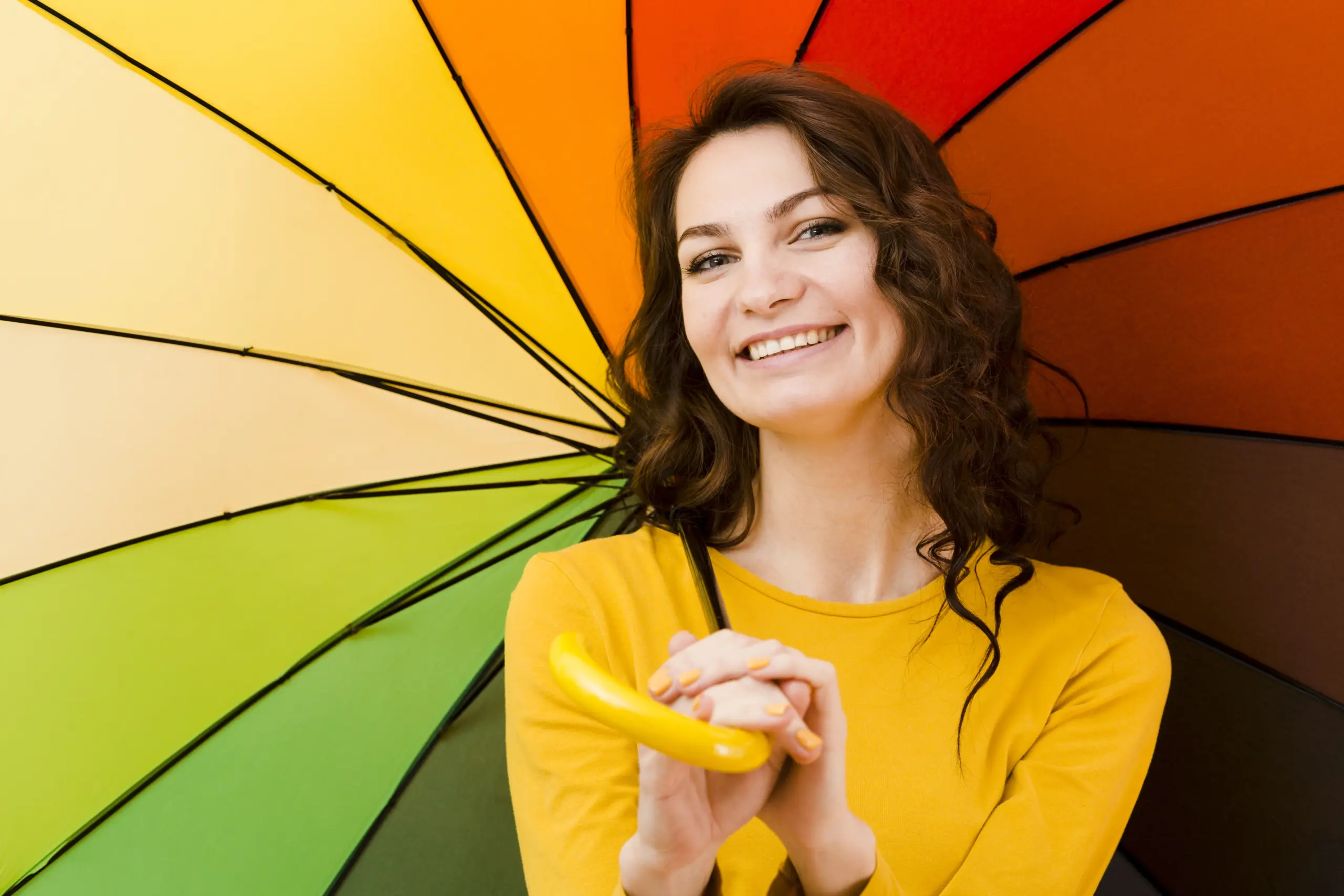
The three primary colours in fashion designing are red, blue, and yellow. These three colours cannot be created by mixing any other colours.
Every other colour used in clothing design comes from combining these three. Mastering these three colours allows any fashion designer to create thousands of outfits without buying expensive pre-mixed fabrics.
Key Takeaways
- Red, blue, and yellow form the foundation of every colour used in fashion design.
- Mixing primary colours creates secondary colours (orange, green, purple) and tertiary colours (six additional shades).
- Primary colours work best as statement pieces, accents, or base layers in clothing collections.
- Colour theory helps designers predict how customers will react to specific colour combinations.
- Fashion illustrations rely heavily on primary colours to establish mood and focal points.
- Understanding primary colours reduces fabric waste and production costs for fashion brands.
- The right use of primary colours can increase clothing sales by up to 85 percent according to retail studies.
Start Your Fashion Journey Today! Learn Advanced Designing & Boutique Skills with Experts!
Introduction
Fashion Designing starts with one simple – albeit profound – question: What colours are going to be the foundation of the next collection? More often than not, even some pretty experienced designers make a hash of answering this question. They go on a shopping spree, buying a whole bunch of different fabric shades and then pretty much just throw the colours together in the hope that something good comes out of it. And of course this is not just unnecessary at best – its a massive waste of time and money at worst.
The fashion world’s top designers are however a different story altogether. They approach this question with a completely different mindset. For them, a new collection is built around just three colours – and these colours are the key to unlocking the potential of every single outfit they design. These three colours can be used for everything from streetwear to formal wear, and all the way on down to children’s clothing.
This guide is going to tell you what those three colours are – and more importantly, exactly how to use them to create a fashion collection that looks and feels like it was put together by a pro.
Master Fashion Designing and Create Your Signature Style
Unlock your creative potential with our expert-led Fashion Designing course. Build in-demand skills and step confidently into the world of fashion!
Begin Your Fashion Career Today!What’s the Big Deal about Primary Colours?
Primary colours are the colours that nothing else can be made from. They’re pure unadulterated pigments with no mixed in anywhere. In fact I think of them as the parents of every other colour that exists – because that’s exactly what they are.
Paint makers and fabric manufacturers create a whole rainbow of colour options for fashion designers to play with. But every one of those colours starts out as either red, blue, or yellow – sometimes even all three at the same time – never none of them. And why is that important, you ask?
Well its all about something called colour mixing. If you know how red, blue and yellow behave then you know exactly what happens when you throw them together on a dress or a t-shirt – there is no room for guesswork. Its like the whole universe of colours has been boiled down to just three key elements – and once you’ve got a handle on how they work together, you can do just about anything.
These colours are known to the scientists as subtractive primaries – and to artists as pigment primaries – but to the rest of us in the fashion world, they’re just the basic building blocks of colour. Whatever label you put on them, their function is the same – they’re the raw materials from which everything else is made.
The Three Primary Colours in Fashion Designing
Red
Red is by far the most emotionally powerful colour in the world of fashion – you can’t help but notice it and that’s no coincidence. People can spot red clothing from across a room because it grabs our attention in a way that nothing else can. In fact, our brains are wired to pick up on red before they even register blue or yellow.
In fashion design, red’s used pretty specifically for a reason. Designers put red in evening gowns when they want the wearer to really stand out from the crowd, red is perfect for activewear too because it screams energy and movement. And let’s not forget red accessories like handbags or shoes – they’re like a beacon drawing your eye exactly where the designer wants it to go.
Red does have cultural connotations that vary wildly depending where you are in the world. In Western countries red means love, danger, or excitement, but in Eastern cultures red is all about good fortune and celebration – which is why smart designers will always take these meanings into account when putting a red collection together.
Blue
Blue is pretty much the most versatile colour you can get in fashion – it’s in a huge number of wardrobes all around the globe. Men wear blue suits, women wear blue jeans, and the kids wear blue school uniforms – and it’s all because blue just looks good on just about every skin tone, simple as that.
Using blue in fashion design is all about it’s calming properties – blue reduces anxiety, suggests trustworthiness and communicates professionalism, which is probably why you see so much blue in office clothes and job interview outfits.
And it’s not just blue that has different effects, different shades of blue serve different purposes in fashion too. Navy blue screams formality and seriousness, royal blue feels bold and confident and light blue comes across as soft and approachable – all of them start off with the same basic primary blue though.
Yellow
Yellow is probably the hardest primary colour to use well in clothing – it bounces back all the light that hits it which can be a real problem for some skin tones and yellow also shows dirt and stains a lot more than darker colours.
But despite all the challenges, yellow’s still a real must-have in fashion design. Yellow creates happiness, signals warmer climes and just looks great as a focal point in any outfit. A yellow handbag can transform a neutral outfit into something with real personality, and a yellow scarf can brighten up even the greyest winter coat.
Professional designers know all about using yellow just in the right amount, they place it strategically to get the maximum visual impact – yellow’s best used as an accent colour rather than the main event, one good yellow piece often sells faster than ten boring neutral ones.
Why Primary Colours Matter in Fashion Design
Primary colours matter because they give designers complete control. When a designer understands how red, blue, and yellow work together, that designer can create any look imaginable. No expensive consultants needed. No complicated colour wheels required.
Most fashion schools spend weeks teaching colour theory. Students learn about warm and cool colours. They study colour psychology. They memorize colour harmonies. All of this knowledge builds on the simple foundation of three primary colours.
There is also a practical financial reason to master primary colours. Fabric suppliers charge more for pre-mixed specialty colours. A yard of pre-mixed purple fabric costs more than a yard of red fabric and a yard of blue fabric combined. Designers who mix their own colours save money on every garment.
Primary colours also age better than trendy shades. A neon green dress looks dated after one season. A red dress remains stylish for years. Collections built on primary colours sell longer and discount less frequently at the end of each season.
Master Fashion Designing and Create Your Signature Style
Unlock your creative potential with our expert-led Fashion Designing course. Build in-demand skills and step confidently into the world of fashion!
Begin Your Fashion Career Today!Understanding Colour Theory in Fashion
Colour theory is the science of how colours interact. It explains why some colour combinations look harmonious while others cause visual discomfort. Fashion designers who ignore colour theory produce clothes that customers refuse to wear.
The colour wheel organizes this information visually. Red, blue, and yellow sit equally spaced around the wheel. Secondary colours fill the spaces between them. Tertiary colours fill the remaining gaps. This arrangement is not random. It shows exactly which colours blend well together.
Warm colours occupy one half of the wheel. Red and yellow are warm colours. They advance toward the viewer in clothing designs. Cool colours occupy the opposite half. Blue is a cool colour. It recedes away from the viewer. Smart fashion designers use this knowledge to shape how bodies appear in their clothes.
A warm red jacket makes the torso appear closer and larger. A cool blue skirt makes the legs appear farther and smaller. Combining these effects changes how proportions look. This is why colour theory matters for every single garment produced.
How Primary Colours Create Secondary and Tertiary Colours
Secondary Colours
Mixing two primary colours creates a secondary colour. The results are predictable and repeatable every single time.
Red and yellow make orange. Orange appears in autumn collections and sportswear. It combines the energy of red with the happiness of yellow.
Yellow and blue make green. Green dominates outdoor and eco-friendly fashion lines. It connects clothing to nature and renewal.
Blue and red make purple. Purple signals luxury and creativity in fashion designing. Many evening wear collections feature purple prominently.
Tertiary Colours
Mixing one primary colour with one secondary colour creates a tertiary colour. These six colours add depth to any fashion collection.
Red-orange comes from red plus orange. Blue-green comes from blue plus green. Yellow-green comes from yellow plus green. Red-purple comes from red plus purple. Blue-purple comes from blue plus purple. Yellow-orange comes from yellow plus orange.
Tertiary colours help designers create subtle variations within a single colour family. A collection based on blue might include blue-green pieces for contrast and blue-purple pieces for depth. Customers perceive these collections as cohesive even when many colours appear.
Using Primary Colours in Clothing Design
Statement Pieces
Statement pieces dominate an outfit. They draw attention immediately. Red works best for statement pieces because of its visual power. A red coat worn over black clothing becomes the entire conversation. A blue suit worn with a white shirt communicates authority. A yellow dress worn alone needs no accessories.
Designers limit statement pieces to one per outfit. Two primary colours competing for attention create visual chaos. The exception happens when the designer deliberately wants chaos for artistic reasons.
Accent Pieces
Accent pieces add small pops of colour to neutral outfits. A yellow handbag with a black dress works perfectly. A red belt with beige trousers draws the eye to the waist. Blue shoes with a grey suit add interest without overwhelming.
Primary colours work better than any other shades for accents. They stand out against neutrals like black, white, grey, and beige. They also stand out against each other when used carefully.
Colour Blocking
Colour blocking places solid primary colours next to each other without patterns or transitions. A red shirt with blue pants creates a bold colour blocked look. A yellow jacket over a red dress creates another variation.
Colour blocking requires understanding of colour theory. Complementary pairs like red and green create maximum contrast. Analogous pairs like blue and purple create harmony. Designers choose based on the emotional response they want from customers.
Primary Colours in Fashion Illustration and Sketching
Fashion illustration begins with primary colours. Professional illustrators use red, blue, and yellow markers or pencils for all initial sketches. They add other colours only after the basic design works.
Red markers indicate areas of visual weight in a sketch. Blue markers show shadow and dimension. Yellow markers highlight details that need attention during production. This system helps design teams communicate without confusion.
Digital fashion illustration programs like Adobe Illustrator and Procreate organize their colour palettes around primary colours. The colour picker tools show exactly where red, blue, and yellow sit on the spectrum. Designers who understand this navigate the software faster than those who do not.
Fashion sketching also uses primary colours to test fabric combinations. A designer can sketch five versions of the same dress using different primary colour arrangements. The best version moves to production. The other versions teach valuable lessons about what does not work.
Start Your Fashion Journey Today! Learn Advanced Designing & Boutique Skills with Experts!
Conclusion
Red, blue, and yellow are not just three colours. They are the complete toolkit for any fashion designer. Every other colour in existence comes from these three sources. Every successful fashion collection respects their power.
New designers who master primary colours skip years of trial and error. They produce better work faster than designers who ignore colour theory and also save money on fabrics. As they make fewer mistakes, their customers return season after season.
The fashion industry changes constantly. Hemlines go up and down. Silhouettes get tight then loose then tight again. Fabrics fall in and out of favour. None of that matters as much as primary colours. These three colours have worked for thousands of years. They will work for thousands more.
Master Fashion Designing and Create Your Signature Style
Unlock your creative potential with our expert-led Fashion Designing course. Build in-demand skills and step confidently into the world of fashion!
Begin Your Fashion Career Today!Frequently Asked Questions
Can fashion designers succeed without understanding primary colours?
Yes, but success becomes much harder. Designers who ignore primary colours waste money on pre-mixed fabrics. They struggle to predict how colours interact. They produce inconsistent collections. Understanding primary colours separates professionals from amateurs.
Do primary colours work for all skin tones?
Blue works universally. Red works for most skin tones. Yellow requires careful selection. Designers should test primary colours against different skin tones before production. A yellow that looks terrible on one customer may look stunning on another.
How many garments in a collection should use primary colours?
Most successful collections feature 60 percent primary colours or mixes of primaries. The remaining 40 percent uses neutrals like black, white, grey, or beige. This ratio keeps collections vibrant without becoming overwhelming.
Are primary colours appropriate for formal wear?
Red appears frequently in evening gowns and tuxedo accents. Blue dominates formal suits and business attire. Yellow rarely appears in formal wear except as small accessories. A yellow pocket square or yellow tie works. A yellow tuxedo does not.
Do expensive brands use primary colours differently than budget brands?
Expensive brands use the same primary colours as budget brands. The difference appears in fabric quality and colour consistency. Luxury brands ensure every red garment matches every other red garment exactly. Budget brands accept minor variations between batches.
Can primary colours help sell more clothes at retail?
Retail data shows primary colours outperform pastels and earth tones in conversion rates. Red items sell fastest but discount earliest. Blue items sell steadily throughout a season. Yellow items sell slowly but attract higher prices from loyal customers.
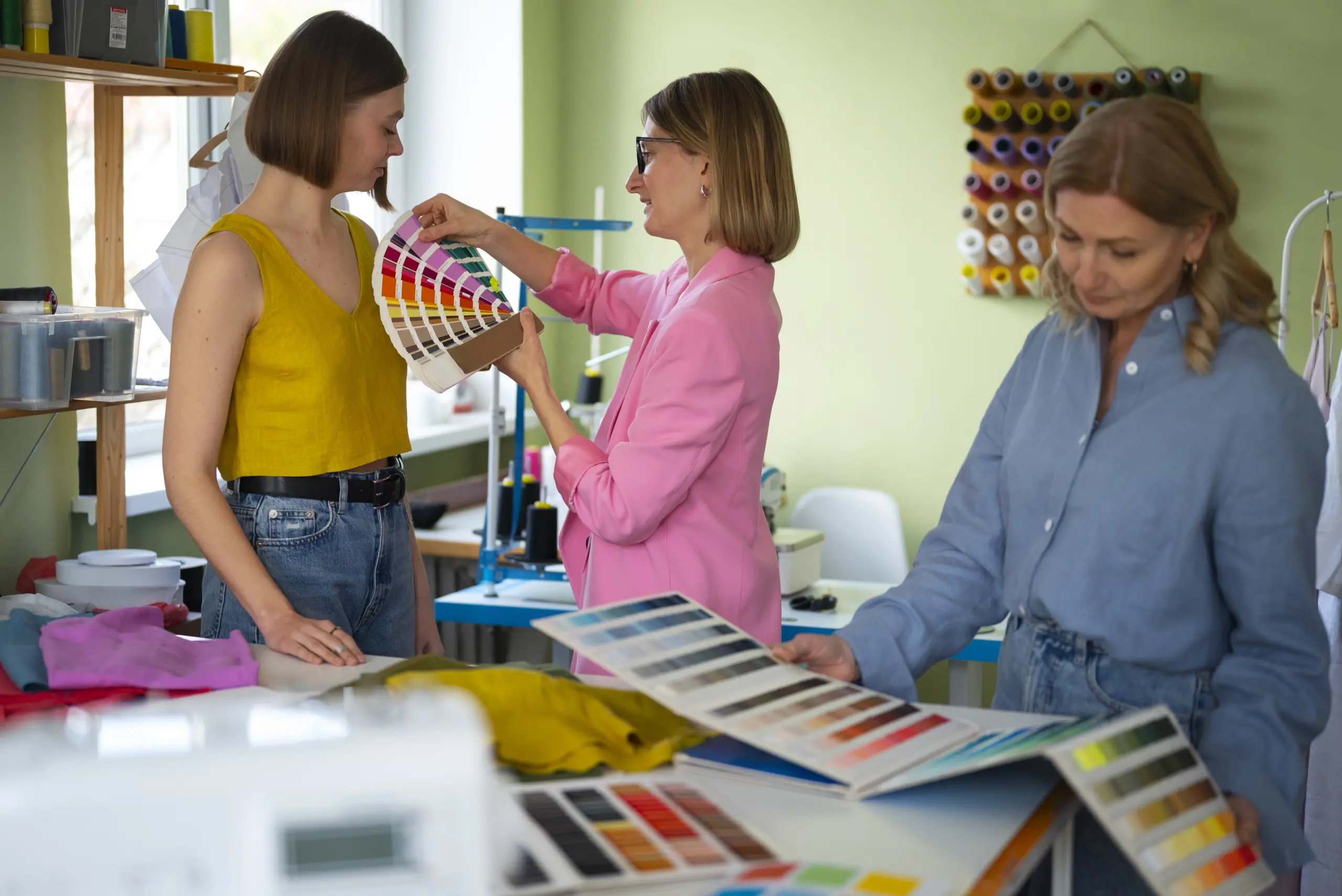
How do fashion designers test primary colour combinations before production?
Designers create small swatch books with fabric samples. They place different primary colours next to each other under natural and artificial light. They photograph combinations and review them after twenty four hours. Fresh eyes catch problems that tired eyes miss.
Do primary colours look different on fabric than they look on paper?
Yes, significantly different. Paper absorbs colour evenly. Fabric reflects light based on texture and weave. A red that looks perfect on paper may appear dull on cotton or too bright on silk. Designers always test colours on final fabrics before committing to production.
What is the most common mistake new designers make with primary colours?
Using too many at once. New designers often combine red, blue, and yellow in equal amounts within one garment. This creates visual confusion. Professional designers use one dominant primary colour and relegate others to small accents or remove them entirely.


