
Table of Contents
Tertiary colours are the missing step between basic mixing and professional results. While primary colours (red, yellow, blue) cannot be made from other colours and secondary colours (green, orange, purple) come from mixing two primaries, tertiary colours combine one primary with one neighbouring secondary. Their names always put the primary first, like yellow-orange or blue-green.
Key Takeaways
- Primary colours stand alone. You cannot mix them from anything else.
- Secondary colours need exactly two primary colours mixed in equal amounts.
- Tertiary colours fill the six gaps between primary and secondary on the wheel.
- Each tertiary colour pairs one primary with the secondary next to it.
- The standard RYB model gives you six tertiary colours total.
- Tertiary colours add richness and depth that basic colours lack.
- Fashion experts use tertiary colours to create looks that feel polished and intentional.
- Learning all three levels stops you from guessing and starts real control.
Start Your Fashion Journey Today! Learn Advanced Designing & Boutique Skills with Experts!
Introduction
Most people never learn colour beyond the basic eight crayon box. They know red and blue. They know green and purple. But something feels wrong when they try to design anything. Their paintings look flat, rooms feel off and their outfits miss something they cannot name.
The missing piece is tertiary colours.
These colours sit between the ones everyone already knows. They are the reason professional work looks layered and rich. They separate a child’s drawing from something you would hang on a wall.
This post teaches you every level of colour. You will learn what makes each type different. You will see exactly how they work together. And you will gain knowledge you can use today in fashion, art, or any design work.
Master Fashion Designing and Create Your Signature Style
Unlock your creative potential with our expert-led Fashion Designing course. Build in-demand skills and step confidently into the world of fashion!
Begin Your Fashion Career Today!What are Colours in Colour Theory?
Colour theory is the secret bible for mixing and matching colours – and also the reason some colour combinations are just a work of art while others just hurt the eyes. Its the whole system is built on three colour levels – and those levels are primary, secondary & tertiary.
Think of these levels like a family tree. Primary colours are the grandparents, secondary colours the kids, and tertiary colours the grandkids – and each level totally relies on the one before it.
Artists, designers, and fashionistas all learn colour theory first – and with good reason, without it every single choice is just a wild guess – but with it, every single choice is backed up by a clear reason.
What are Primary Colours?
Primary colours are the foundation on which everything else is built. And you can’t make ’em by mixing other colours – they’re pure, original, and nothing else will do. And in the really popular RYB colour model that most painters use, the three primary colours are red, yellow, and blue.
These three are complete originals – every other colour on the colour wheel comes from mixing them in some way.
Here’s what makes primaries special though : if you only had red, yellow and blue paint you could make every other colour on the wheel – but no combination of any other colours will ever give you pure red back again. That’s why they’re called primary – they come first.
Red grabs your attention quicker than nuthin else. Yellow sends a message that its warm & a little bit of a warning sign. Blue just creates a sense of calm & trust. Each primary colour comes with its own special feeling.
What are Secondary Colours?
So secondary colours happen when you mix two primary colours in equal measures – and the RYB colour wheel gives you exactly three of them.
Mix red & yellow & you get orange
Mix yellow & blue & you get green
Mix blue & red & you get purple
These colours are all pretty familiar-sounding – but still not as intense as their primary parents. Orange is softer than red or yellow on their own – green balances out the brightness of yellow with the coolness of blue. Purple just takes the energy of red and the calmness of blue.
Secondary colours show you how mixing can open up new possibilities – but they’re still just the starting point for the whole colour theory story.
Master Fashion Designing and Create Your Signature Style
Unlock your creative potential with our expert-led Fashion Designing course. Build in-demand skills and step confidently into the world of fashion!
Begin Your Fashion Career Today!What are Tertiary Colours?
Now we’ve finally reached the answer from the very start. Tertiary colours fill in the gaps between primary and secondary colours on the colour wheel. Each one combines a primary colour with the secondary colour right next to it.
The standard RYB colour model has six of these colours.
You get yellow-orange when you mix yellow with orange.
Or red-orange when you mix red with orange.
And you get red-purple when you mix red with purple.
Blue-purple is the result of combining blue with purple.
It takes blue and green to get blue-green.
And yellow and green to get yellow-green.
Take a close look at the pattern in the names. The primary colour always comes first. So it’s yellow-orange, not orange-yellow. Red-purple is how you say it, not purple-red. That’s a single rule that keeps things running smoothly across loads of different design fields.
Tertiary colours can be more complicated to look at than primary or secondary colours. They’ve got the energy of their primary parent but the depth that comes from the secondary parent. They’re muted but they’re not dull. They’re sophisticated, but not too confusing.
A pure red will grab your attention, no question. But a red-purple will just whisper at you to take notice. A bright yellow can feel urgent. But a yellow-orange feels more like a warm and patient sort of vibe.
Getting these small details right makes a big difference in fashion and design. The difference between wearing an outfit that’s just okay and one that’s really great can come down to choosing a tertiary colour instead of settling for a primary or secondary.
The Difference between Primary, Secondary, and Tertiary Colours
It all comes down to three things : how they’re mixed up, how many there are, and where they sit on the colour wheel.
Primary colours can’t be mixed from existing colours – they’re the only ones that can’t – and there are three of them. They sit evenly spaced on the wheel.
You get secondary colours by mixing two primaries together in equal measure. And there are three of them. Each one sits between two primaries on the colour wheel.
But tertiary colours need one primary and one secondary colour sitting right next to each other to be mixed up. And there are six of them. Each one sits between a primary and a secondary on the colour wheel.
Another difference is how much of an impact they have. Primary colours look bold and simple. Secondary colours look a tad more sophisticated but still pretty predictable. Tertiary colours, on the other hand, look more complex and like they’ve been thought about.
A room painted in just primary colours feels like a nursery school classroom. A room in secondary colours looks a bit like a basic colouring book. But a room that’s got some tertiary colours in it? That looks like a room designed by someone with actual talent.
Colour Wheel Explained
The Colour Wheel : A Map of Colour Relationships
- The colour wheel is basically a circular map that shows you how colours fit together in a logical order. Every colour has its own special place on the wheel.
- Primary colours sit at the three main points on the wheel – think of them as the three corners of a triangle. Secondary colours are right in the middle of each pair of primaries & Tertiary colours fill in the gaps.
If you draw a wheel with 12 sections – and start at the top – the colours are arranged in this order.
Yellow’s the primary colour.
Then comes Yellow-Orange, which is a Tertiary colour .
Next up is Orange, which is a secondary colour.
Red-Orange is another Tertiary colour.
Red is a primary colour.
Red-Purple is a Tertiary colour.
Purple’s a secondary colour.
Blue-Purple is another Tertiary colour.
Blue’s a primary colour.
Blue-Green is a Tertiary colour.
Green’s a secondary colour.
And finally Yellow-Green is a Tertiary colour.
The Colour wheel is a great tool for helping you decide which colours work well together. Colours that sit opposite each other are called Complementary colours . They create that ‘wow factor’ because of the high contrast they create. Colours that sit next to each other on the wheel are called Analogous colours. They work well together and create that sense of calm you get from well chosen colours.
The main benefit of Tertiary colours is they give you more options. Without them you’ve got just 6 colours to choose from. With them you can choose from 12 colours. That extra choice means you can pick colours that work really well together and come up with combinations that are really interesting.
How Primary Colours Make Secondary and Tertiary Colours happen
Mixing colours is a pretty simple process but it does get a bit more complex as you go along.
First off you need some pure primary colours – literally get the three colours in three separate tubs – Red, Yellow & Blue.
Next you mix equal parts of two primaries together. This is how you get your secondary colours – Red & Yellow makes Orange. Yellow & Blue makes Green. Blue & Red makes Purple. Now you’ve got secondary colours.
Now take a primary and the secondary colour that’s right next to it on the wheel and mix equal parts of them together.
This is how you get Tertiary colours.
Red plus Orange gives you Yellow-Orange.
Red plus Purple gives you Red-Purple
Blue plus Green gives you Blue-Green.
Blue plus Purple gives you Blue-Purple.
And so on.
Each Tertiary colour gets its best bits from its parents – Yellow-Orange gets its brightness from the Yellow and its warmth from the Orange. Blue-Green gets its calm from Blue and its freshness from Green.
But you don’t have to stick to equal parts – you can adjust the ratio to create loads of different variations. More of one colour will give you a slightly different shade. Less of one colour and it’ll be a bit different again. But to get that perfect Tertiary colour you need to keep the mix equal.
This process works for paint, digital design, fabric & even makeup. The science behind how light works is a bit different but the basic RYB model applies to all sorts of physical mediums where you’re mixing pigments together.
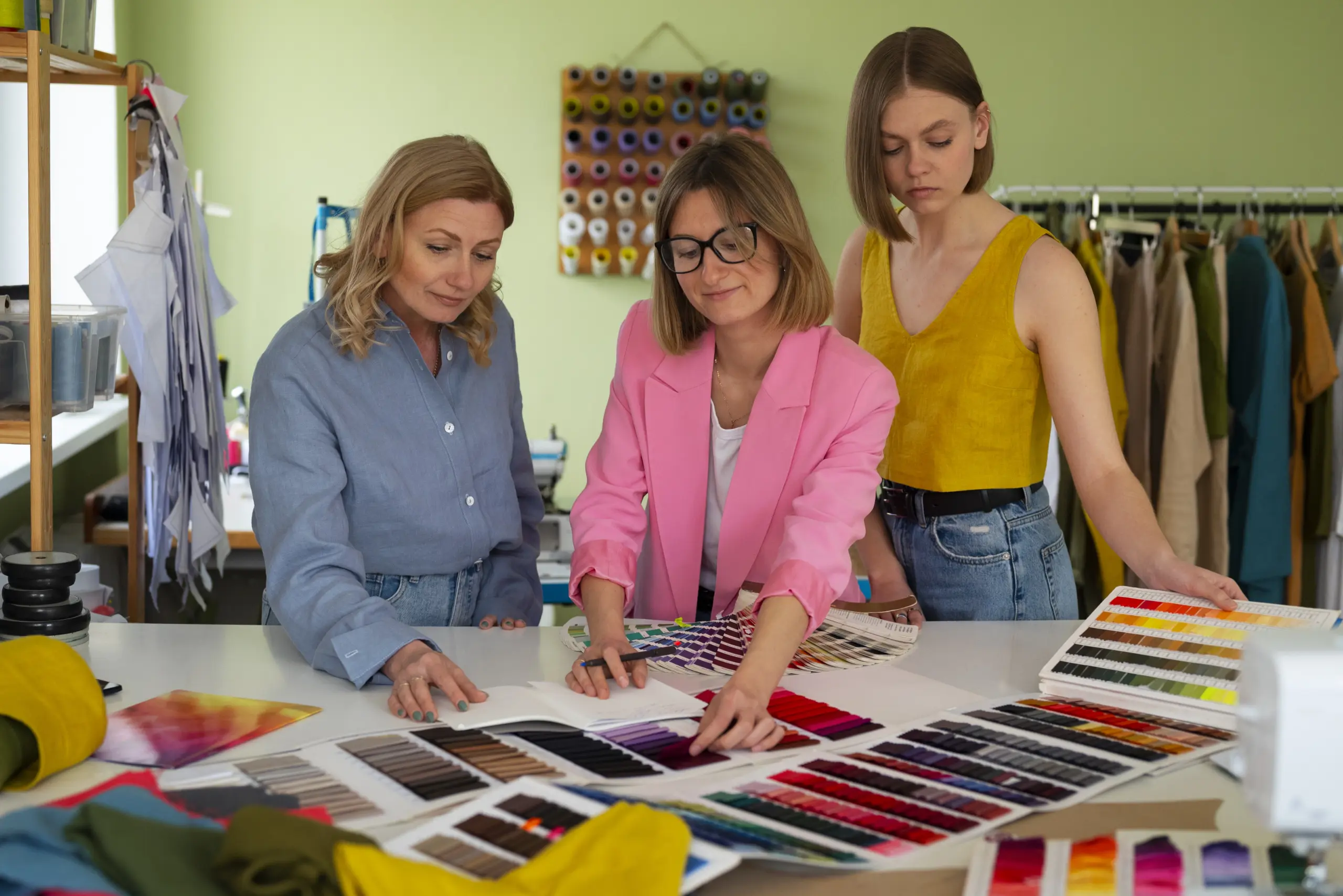
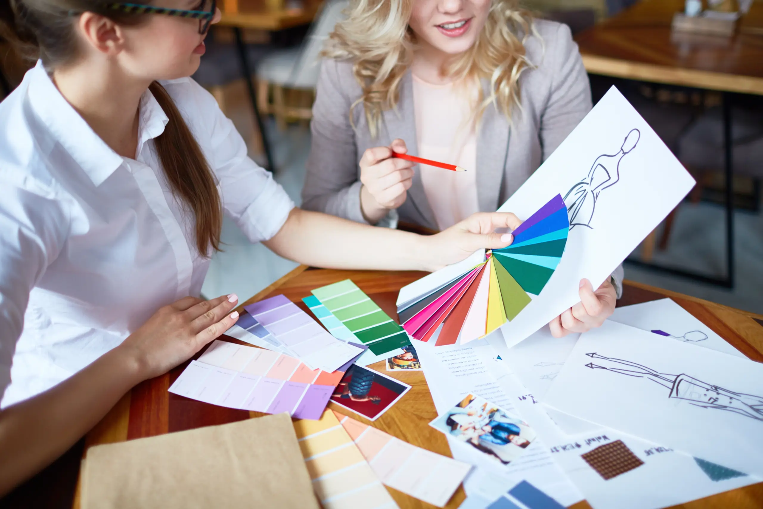
Examples of Primary, Secondary and Tertiary Colours in Fashion
Fashion shows the raw power of tertiary colours in ways hardly any other field can match.
A red dress comes on strong and says something. A red orange dress tells a completely different story – warm and inviting, rather than loud and in-your-face.
Think of a summer outfit. A bright yellow shirt can feel playful but also a bit daft. A yellow orange shirt keeps that energy but adds a bit of maturity to it – enough to make it pair well with olive pants or brown shoes because it’s got that orange warmth already built in.
Now think office clothes. A pure blue suit feels like the traditional choice, the usual. A blue green or even a blue purple suit feels forward thinking, like you’ve put some thought into what you’re doing. That tiny shift towards a tertiary colour tells people you’re not just going through the motions.
Evening wear, by the way, really benefits from red purple and blue purple. These colours are richer than any basic purple – they catch the light in a whole different way, and they photograph well. They can cut through a crowd of standard jewel tones like a hot knife through butter.
Streetwear brands use tertiary colours all the time. A yellow green hoodie feels fresher, and more interesting than a plain green one. A red orange sneaker feels like you’ve put some thought into your choice, rather than just grabbing the nearest red one off the shelf. That small difference shows you’ve got taste.
Start Your Fashion Journey Today! Learn Advanced Designing & Boutique Skills with Experts!
Conclusion
Primary colours start everything – they’re pure and simple. Secondary colours add a bit more to the mix – they’re familiar and balanced. Tertiary colours bring it all together, if you will – they’re sophisticated and intentional.
You can’t really master colour without getting to grips with all three levels, though. The difference between amateur work and something really professional often comes down to whether you’ve got the right tertiary colour on your side, rather than just reaching for the nearest primary or secondary.
The next time you pick a paint colour, choose an outfit, or design a graphic, ask yourself this simple question: are you playing with primary, secondary, or tertiary? If you stop at the first two levels, you’ll be leaving half your best options right back on the table.
Never mind the basics – step beyond the simple colour wheel. Learn the six tertiary colours and use them properly. Notice them in the world around you – once you’ve seen them, you can’t unsee them. And your work will never look flat again.
Master Fashion Designing and Create Your Signature Style
Unlock your creative potential with our expert-led Fashion Designing course. Build in-demand skills and step confidently into the world of fashion!
Begin Your Fashion Career Today!Frequently Asked Questions
What makes primary colours different from all other colours?
Primary colours cannot be created by mixing any other colours together. Red, yellow, and blue stand alone as the only pure colours on the wheel. Every other colour comes from mixing these three in different amounts. That is what makes them primary.
How do you mix a true secondary colour?
Mix two primary colours in exactly equal amounts. Too much red makes the orange too dark. Too much yellow makes the orange too light. Equal parts give you the true secondary. The three true secondaries are orange, green, and purple.
Why are there six tertiary colours instead of three?
The colour wheel has twelve positions total. Three positions hold primary colours. Three positions hold secondary colours. The remaining six positions fall between each primary and its neighbouring secondary. Each gap needs its own tertiary colour to complete the wheel.
What is the correct way to name a tertiary colour?
Always say the primary colour first, then the secondary colour. Yellow-orange is correct. Orange-yellow is wrong. Blue-green is correct. Green-blue is wrong. This rule applies to all six tertiary colours and keeps naming consistent across art, design, and fashion.
Can you make tertiary colours without using secondary colours first?
No. You need a secondary colour already mixed before you can make a tertiary colour. The process has two steps. First mix two primaries to get a secondary. Then mix that secondary with a neighbouring primary. Skipping the first step gives you the wrong result.
Which tertiary colours work best for a professional wardrobe?
Blue-green and blue-purple work well for office clothes because they feel modern but not flashy. Yellow-orange and red-orange work for casual wear because they add warmth without screaming for attention. Red-purple works for evening events because it looks richer than basic purple.
Do digital screens use the same primary colours as paint?
No. Digital screens use red, green, and blue as their primary colours. Painters and designers working with physical materials use red, yellow, and blue. The mixing rules stay the same at each level, but the starting primary colours change depending on your medium.
What happens when you mix a tertiary colour with another tertiary colour?
You move further away from pure colours and closer to neutral browns or greys. Mixing two different tertiary colours creates a muddy, desaturated result. Most professional artists avoid mixing tertiary colours together. They prefer mixing a tertiary with a primary to keep control over the result.
How do tertiary colours improve a room's paint scheme?
Tertiary colours add depth that primary and secondary colours cannot provide. A blue-green wall feels more restful than a bright blue wall. A red-orange accent wall feels warmer than a pure red wall. Tertiary colours let you create mood without overwhelming the space.


