
Table of Contents
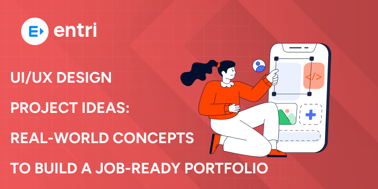
Most UX/UI portfolios tend to be similar since each rookie designer creates projects like a login screen, food delivery app, or dashboard. Recruiters simply skip these kinds of designs because they have seen similar projects many times before. The following guide offers eight ideas for unique projects that will impress potential employers in your interview. Select one of them, create a full case study on it, and wait for positive changes in your career.
KEY TAKEAWAYS
- A beautiful login screen is not enough because recruiters want to see problem solving skills.
- You must show your research and wireframes since the final UI is only half the story.
- Pick projects that matter like mental health or finance because these show depth and empathy.
- Measure your outcomes to prove whether your design made tasks faster or easier for users.
- Present every project as a full case study that includes the problem, process, solution, and results.
INTRODUCTION
1: Which of the following data structures allows elements to be added and removed in a Last-In, First-Out (LIFO) order?

A lot of UI/UX portfolios out there start to look just the same because we keep building the same tired ideas : a food delivery app on page 1, a fitness tracker on page 2 and a music player somewhere in the middle. Yeah the interfaces might look nice enough, but they just don’t feel original and it’s pretty hard to see any actual problem solving going on in there.
The recruiters who are tasked with looking at all these portfolios spend an average of about 30 seconds on each one before making a decision. And if your portfolio looks like every single other one they see, guess what? they’re moving on to the next one before even considering you for an interview. It’s not even about whether you actually have the skills to do the job – you might be a perfectly good designer but your work is just going to get lost in the sea of me-too portfolios.
And it’s really not about your skill level thats the problem, its the projects you choose to do. Most beginners, just pick the same old tried and tested ideas like ecommerce stores and weather apps without even stopping to think twice about it. And guess what – a pretty weather app interface tells you absolutely nothing about your UX process because you can’t see the actual problem you were trying to solve or who your users even were.
Get Certified in UI/UX Design — Build User-Friendly Experiences with Confidence!
PROJECT 1: GIVE THE JOB SEARCH PROCESS A MAKEOVER
Job seekers spend literally hours filling out the same old info on every application because each and every platform asks for your work history and education separately. Its a slow painful process that leaves a lot of people just giving up before they even finish. Your target users should be active job seekers and recent grads just getting their feet wet in the workforce. Truth is we all need a better experience for finding jobs – one that lets us search and apply in minimal time. Everyone complains about the state of job search sites but very few designers try to actually fix the problem. A complete redesign with real research shows you actually care about the users who are sweating blood over getting a new job.
PROJECT 2: MENTAL HEALTH SUPPORT APP
Most people struggle to track their moods and emotions because they dont have a simple tool to do it each day. They also dont know when to seek help, and they really need some solid calming resources when stress strikes.
Your users are probably people with anxiety or depression, and anyone who wants to get a handle on how their emotions work. Accessibility is a big one – people who are feeling really down are not going to be able to handle some super complicated interface. And then there’s the issue of privacy – users need to be able to control their own data. Mental health projects are a lot more meaningful because you are actually trying to help people who are struggling to cope, and thats something we all remember when it comes to hiring.
Get Certified in UI/UX Design — Build User-Friendly Experiences with Confidence!
PROJECT 3: LOCAL SERVICE FINDER APP
Finding a reliable tradesperson in a new city is far easier said than done – online reviews are often completely fake and trying to get a hold of someones contact details can be a nightmare in itself. The seemingly simple task of getting a quote can be a multi phone call , days or even weeks wait.
Your target users should be mainly homeowners needing repairs, but also parents on the hunt for reliable tutors etc. The search experience should have useful filters for price and rating, plus any trust signals like verified reviews and licenses that you can get your hands on. Local services are a massive market that designers tend to ignore, but this project shows you can actually design something that builds trust and safety.
PROJECT 4: Building on Skill Through ELEARNING PLATFORM
You’d think that with so many great online courses out there, completion rates would be pretty high – but the reality is the opposite – most students start off excited to learn but just two or three weeks in they’ve lost all motivation and quit. The platform itself does nothing to keep them going – there’s no accountability and just about every student falls off the wagon.
Your users should be people in work who are trying to pick up new skills in whatever spare time they can muster. Any user engagement will need to be driven by gamification elements like badges for completing modules and progress bars that show just how far theyve come. The EdTech market is growing fast, and companies really need designers who have an understanding of how people actually learn and retention strategies.
PROJECT 5: PERSONAL FINANCE MANAGEMENT APP
The sad truth is most people have no idea what their money is being spent on because bank apps just show you your transactions – not any useful patterns in your spending. Saving money is a real pain because you have to do it the old fashioned way with spreadsheets thats just about never done consistently – who has the time on top of everything else.
You might find your users are young adults just starting their careers or anyone who struggles with money in general. Data visualisation turns dry numbers into clear charts that make it easy to see your spending by category and all at a glance. Simplicity is key – too many features just confuse users. Thats the thing about finance apps, they are genuinely hard to get right. Doing it well will definitely catch the eye of some recruiters.
PROJECT 6: HEALTHCARE APPOINTMENT BOOKING APP
Booking a doctors appointment is still a pain point for nearly everyone – you have to make a phone call during work hours, and then spend ages on hold waiting for some free time on the doctors part. There just isn’t a simple way to compare doctors or get an idea of what the wait times are looking like.
Your target users should be patients with chronic conditions or carers booking appointments for elderly relatives. Accessibility for everyone, all ages, is a real must because elderly users will need larger text and far simpler navigation. This project is a great chance to get your head around designing for people who are already under stress or pressure.
PROJECT 7: TRAVEL PLANNING EXPERIENCE
Planning a decent trip is no small feat and often comes down to juggling multiple apps – one for booking flights, another for hotels, and yet another for keeping track of your final itinerary. The problem is, none of these services sync with each other, so you end up with a patchwork of different systems.
The people who would get the most use out of this type of project are probably vacation planners trying to organize family trips or group trip organisers trying to keep everything straight with friends. Any multi-step workflow needs to have clear progress indicators so you can see how far along you are, and it’d be nice if groups could plan together on the same itinerary. At the end of the day travel planning is a complicated beast, and this project shows that you can handle that complexity without confusing your users.
PROJECT 8: DASHBOARD DESIGN FOR SAAS
Business tools are notorious for dumping way too much information on you at once which ends up overwhelming you and making it impossible to find the numbers that actually matter. A lot of people just give up on these tools altogether because the dashboard is more stressful than helpful.
The kinds of people who would use a product like this are probably business owners trying to get a bird’s eye view of things or marketing managers looking for data on their latest campaigns. The key to making a SaaS dashboard work is figuring out the right hierarchy of information – i.e. what do you want people to see first? And then you need to give users the ability to customize their own views – because what’s most important to one person may not be the same for another. SaaS dashboards are everywhere these days, and this project shows that you get business users and you know how to turn raw data into something useful.
Top Summer Internships in India in 2026
From Google to top Indian companies, find internships that match your skills and goals. Everything you need to apply is right here.
Explore Internships NowWHAT MAKES A PORTFOLIO STAND OUT

First off a strong project always starts with a clear problem statement that can be summed up in one sentence. After that you need to do some proper user research – even if it’s just interviewing a few people – because documenting what you learned is the thing that’ll prove you didn’t just cheat your way to a design. Your wireframes should show off your thinking at every stage, and you should test out your ideas in their ugly, rough form before you go and pretty it up.
You should never just submit slick UI screens without any context, because a pretty interface with no research is basically just a design with no substance. And please, for the love of all things good, don’t just copy designs from Dribbble – original work with real flaws is always better than some perfect but unoriginal design. And hey, don’t forget to explain every design decision you made – even down to why you chose a particular button or color – because every element should have a clear reason behind it.
Instead of just dropping screenshots into a grid, present your project as a complete case study, and make sure you include the problem you were trying to solve, your research, your wireframes, your final design, and what you learned along the way. Keep your storytelling clear and to the point, since recruiters are only going to have a couple of minutes to look at your case study. Include a link to a live prototype so they can actually click through your design for themselves.
Get Certified in UI/UX Design — Build User-Friendly Experiences with Confidence!
CONCLUSION
So there you have it – eight different UI/UX project ideas that go way beyond the usual login screens and food delivery apps that clutter up most portfolios. Each one solves a real problem, and gives you room to show off your research, testing, and iteration from start to finish.
Pick the project that really speaks to you – whether that’s something like mental health because you genuinely care about emotional design, or healthcare because you think it’s a field that’s crying out for some innovative thinking. Build a complete case study that shows your process, and presents everything in a clear and easy to follow way.
The thing is, recruiters are looking at hundreds of portfolios every week, and they all look pretty much the same. So if you want to get the interview call, you need to give them something different – something that shows how you think, and how you solve problems.
Top Summer Internships in India in 2026
From Google to top Indian companies, find internships that match your skills and goals. Everything you need to apply is right here.
Explore Internships NowFrequently Asked Questions
How many projects should I include in my UI/UX portfolio?
You should include three to four complete projects rather than eight shallow ones. Recruiters prefer depth over quantity because a single well documented case study tells them more than several unfinished ideas. Focus on quality research and clear storytelling for each project you include.
Do I need to build a working app or just design the screens?
You only need to design the screens and create a clickable prototype in Figma. Recruiters want to see your design process, research methods, and thinking, not fully functional code. A working prototype that demonstrates user flows is more than enough for a UX portfolio.
Which project from this list is best for a complete beginner?
The eLearning platform or the local service finder are the best choices for beginners. These projects have clear user needs and straightforward problems to solve without requiring advanced design skills. You can complete a solid case study in four to six weeks with regular practice.
How do I conduct user research without access to real users?
You can interview friends, family members, or coworkers who match your target user profile. Five interviews are enough for a portfolio project. You can also post surveys on social media or use platforms like Reddit to find people willing to answer a few questions about their experiences.
Should I redesign an existing app or create something completely new?
Redesigning an existing app is actually better for your portfolio because you can compare your solution to the current version. Pick an app with clear usability problems, document what is wrong with it, and show how your redesign fixes those specific issues. This approach gives you measurable outcomes to discuss.
How important is usability testing for a portfolio project?
Usability testing is very important because it proves your design actually works for real users. You can test your prototype with three to five people using Maze or UsabilityHub. Document what users struggled with, fix those problems, and show the changes you made. Recruiters love seeing this iteration process.
Can I include group projects from school or a bootcamp in my portfolio?
Yes, but you must clearly explain your specific role and contributions. If you worked in a team of three, state exactly which parts you designed and researched. Do not take credit for work you did not do because recruiters will ask about your process in interviews and catch any dishonesty.
What should I do if my final design is not perfect or beautiful?
That is completely fine because recruiters care more about your thinking than your visual polish. A case study with thorough research, clear problem solving, and honest lessons learned is far more impressive than a beautiful design with no substance. Just be honest about what you would improve with more time.
How do I present my case study on my portfolio website?
Each case study should follow the same structure. Start with the problem statement, then show your research findings, then present your wireframes and early sketches, then show your final high fidelity designs, and finally share what you learned and what you would do differently. Include plenty of images and keep your text scannable.


