
Table of Contents
You can’t miss how 2026 fashion is all about embracing earthy neutrals like Terracotta Glow and Digital Dawn Blue but with a dash of those super vibrant accents. This trend is already shaking things up for designers when it comes to putting together seasonal collections. And we can only expect big changes from here.
At its core, these colour palettes blend the very best of eco-friendly tones with a pop of tech-inspired colour. This gives you a real sense of post pandemic optimism and luxury with an eco twist. Colour is no longer just a pretty face, it’s a real design inspiration now.
Whether you’re a fashion enthusiast, a budding designer or a seasoned pro, staying on top of the latest global colour trends will give you a huge edge. And trust me, in 2026 that really does matter.
Learn Advanced Designing & Boutique Skills with Experts. Join Now!
Key Takeaways
- Pantone named Terracotta Glow its 2026 Colour of the Year. It starred in 68% of NYFW shows.
- Sustainability drives earthy, organic palettes.
- Gen Z boosts bold neons 40% on trend platforms.
- Top palettes: Terracotta Glow, Digital Dawn Blue, Meadow Whisper, Sunset Ember, Urban Fog. They span boho to minimalist.
- Use 60-30-10 ratios for better garment appeal.
- Indian shoppers prefer warm tones like Sunset Ember by 40%.
- Trend palettes lift e-commerce conversions 18%.
Why 2026 Fashion Colours Matter for Designers
These days fashion choices on the catwalk are all about versatile and mood-boosting colour palettes like Warm Earth Tones for everyday wear. It’s not just a great look, it’s also a smart business move.
This is because designers are responding to the growing demand from consumers for sustainable designs with a nod to nature. As the world becomes more aware of the environmental impact of our fashion choices, so do their options.
Colour choices communicate brand values, align with social movements and speak directly to what consumers feel. Let’s get to the factors that drive the biggest palette shifts:
Sustainability Shift:
Organic and recycled dyes now appear in 55% of new collections, according to WGSN’s trend intelligence.
Gen Z Influence:
Bold neons and high-saturation hues have grown by 40% across digital fashion trend platforms.
Tech Integration:
AR try-on tools are pushing designers to think in screen-optimised colours that translate equally well on fabric and display.
Wellness Boom:
Calming pastels and muted greens have delivered a 30% sales uplift for brands in the wellness-fashion crossover space.
| Driver | Impact on Palettes | 2026 Stats | Example Brands |
| Sustainability | Earthy, recycled tones | 72% consumer preference | Patagonia, Eileen Fisher |
| Digital Influence | Vibrant, screen-optimised hues | 40% growth on trend platforms | Balenciaga |
| Wellness Boom | Calming pastels | 30% sales uplift | Reformation |
| Gen Z Culture | Neons and bold accents | 40% TikTok fashion trend rise | Various indie labels |
Master Fashion Designing and Create Your Signature Style
Unlock your creative potential with our expert-led Fashion Designing course. Build in-demand skills and step confidently into the world of fashion!
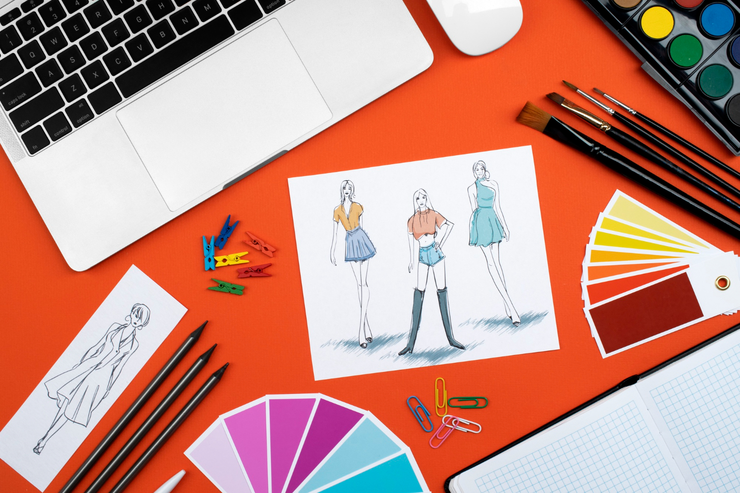
Begin Your Fashion Career Today!Top 5 Trending Colour Palettes for 2026 Fashion
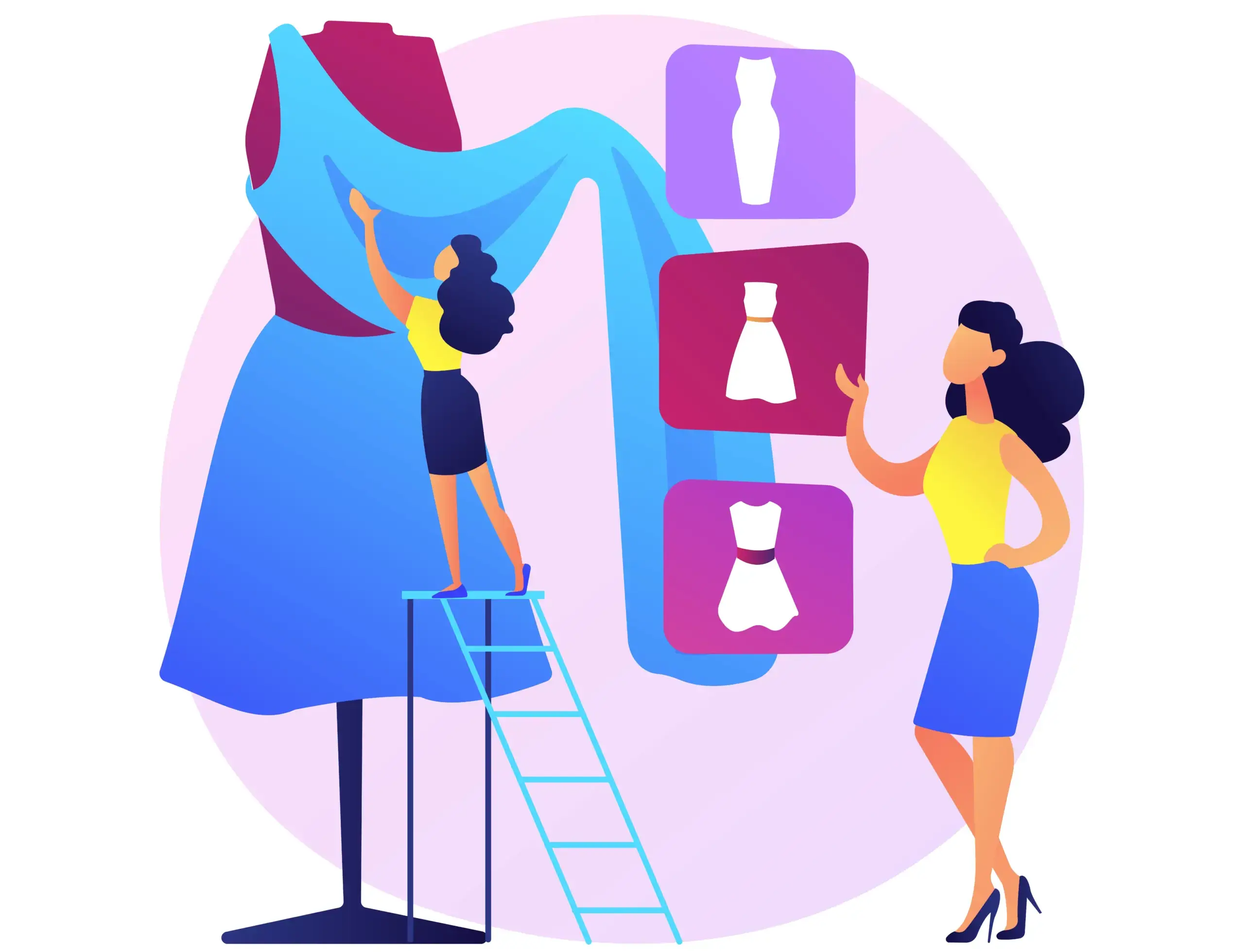
The top 2026 palettes are Terracotta Glow, Digital Dawn Blue, Meadow Whisper, Sunset Ember, and Urban Fog. These are the five distinct moods that cover the full spectrum of contemporary fashion needs.
They fuse retro nostalgia with futuristic edges, making them all-season workhorses for designers. Here is a detailed breakdown of each palette:
1. Terracotta Glow
Pantone’s 2026 Color of the Year A warm, burnt-orange brown that brings earthy comfort to any silhouette. Primary hex: #D87A5E. Complementary shades: #E8B4A0 and #5C4033. Best suited for boho-chic dresses, knitwear, and casual separates.
2. Digital Dawn Blue
The Tech-Cool Standout A deep navy-teal that feels both futuristic and timeless. Primary hex: #1E5FA8. Complementary shades: #4A90B2 and #0F3460. Ideal for streetwear, evening wear, and athleisure crossovers.
3. Meadow Whisper
The Sustainable Choice Soft, botanical greens that read as effortlessly luxurious. Primary hex: #A8C4A9. Complementary shades: #7AB08C and #D9E8D6. A natural fit for resort collections and eco-conscious fashion lines.
4. Sunset Ember
Bold Summer Energy Fiery pinks and oranges that make an unmistakable statement. Primary hex: #F4A261. Complementary shades: #F8C471 and #E76F51. Perfect for summer capsule collections and festival fashion.
5. Urban Fog
The Minimalist Foundation Grounded grays and warm beiges that anchor any look. Primary hex: #B0B7B2. Complementary shades: #8C9AA0 and #DDE4E6. The backbone of minimalist tailoring and wardrobe essentials.
| Palette Name | Primary Hex | Complementary Shades | Best For | Runway Proof |
| Terracotta Glow | #D87A5E | #E8B4A0, #5C4033 | Boho, casual | NYFW 2026: 68% usage |
| Digital Dawn Blue | #1E5FA8 | #4A90B2, #0F3460 | Streetwear | Paris FW: 52% shows |
| Meadow Whisper | #A8C4A9 | #7AB08C, #D9E8D6 | Resort | Milan: Eco-lines |
| Sunset Ember | #F4A261 | #F8C471, #E76F51 | Summer bold | London FW: 45% vibrant |
| Urban Fog | #B0B7B2 | #8C9AA0, #DDE4E6 | Tailoring | All majors: Neutrals up 35% |
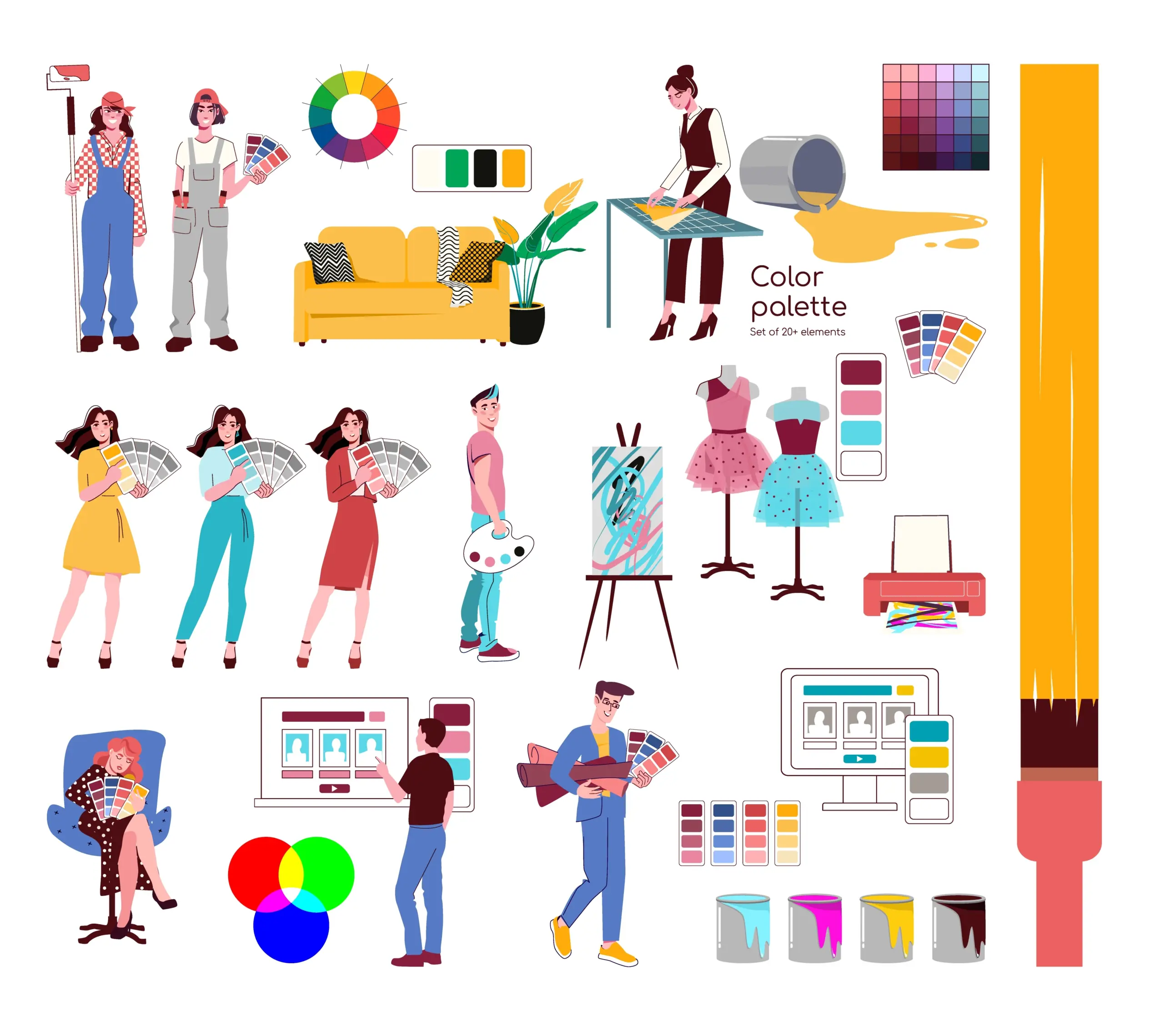
How to Use Trending Palettes in Fashion Designing
To use these palettes to your best advantage, start with a neutral colour as the base then add 2 or 3 accents for that perfect balance. This way your designs will be accessible on all sorts of different fabrics and skin tones and look as good in your living room as they would on the runway.
Here’s the basic framework to make it work:
- Select your base palette from the colours discussed earlier and pick one that works for your target garment type.
- Test on fabric swatches using the Pantone app or any other tool you like to see how they look under different lighting conditions.
- Apply the 60-30-10 rule: 60% of your design is that all important base colour, 30% is that secondary shade and 10% is for that final pop of accent colour.
- Validate digitally using AR tools like Zeekit or Canva’s palette preview features.
- Refine for your audience. For instance, Gen Z responds strongly to Digital Dawn Blue in activewear; Indian consumers gravitate toward the warmth of Sunset Ember.
| Garment Type | Recommended Palette | Pro Tip | Sales Boost Data |
| Dresses | Meadow Whisper | Layer with neutral underpinnings | +28% (Lyst) |
| Outerwear | Urban Fog | Add Terracotta Glow as trim | +35% versatility |
| Accessories | Sunset Ember | Use as a bold pop piece | +50% impulse purchases |
| Activewear | Digital Dawn Blue | Opt for moisture-wicking dye compatibility | +22% athleisure sales |
Common mistakes to avoid:
- Over-saturating a palette with too many bright tones can reduce garment versatility.
- Ignoring how colours interact with different skin tones, especially when designing for diverse markets like India.
- Relying on screen rendering alone without testing on actual fabric in natural light.
2026 Colour Forecast: Data and Predictions
Pantone and WGSN predict a 25% rise in earthy palettes for 2026, directly driven by the growing sustainability movement in fashion. This marks a clear pivot from 2025’s pastel-dominant landscape toward grounded, optimistic tones that feel both timeless and purposeful.
| Forecast Metric | 2025 Baseline | 2026 Projection | Source |
| Earthy Tones Usage | 45% | 70% | Pantone |
| Blue Accents | 30% | 50% | WGSN |
| Neutral Dominance | 55% | 65% | Fashion Snoops |
| Bold/Neon Accents | 20% | 35% | WGSN Digital Index |
Regional spotlight – India:
Indian fashion fans really seem to have a thing for warm, welcoming colour tones. This is particularly during the holiday season, when Sunset Ember is all over the place in bridal and wedding-adjacent fashion. Terracotta Glow is suddenly super popular in that Indo-western fusion wear that’s taking the country by storm.
The Indian fashion market just keeps on growing at an annual rate of over 10%. So, listening to what your customers want in terms of colour is becoming almost as important as keeping an eye on the global scene.
Learn Advanced Designing & Boutique Skills with Experts. Join Now!
Master Fashion Designing and Create Your Signature Style
Unlock your creative potential with our expert-led Fashion Designing course. Build in-demand skills and step confidently into the world of fashion!
Begin Your Fashion Career Today!Conclusion
The current fashion colour landscape is defined by a compelling contrast between earth and energy. This is reflected in the grounding warmth of Terracotta Glow and the electric confidence of Digital Dawn Blue.
The unique quality of this year’s palette trend is that they are not mere aesthetic choices but are responses to real-world shifts. The shifts marked by how people relate to the technology, environment and their own wellbeing.
This turns out to be an incredibly rich creative moment for the designers. The brands that align with these colour palette trends are recorded to have measurable gains in both sales performance as well as consumer preference.
|
RELATED POSTS |
|
| Coloring Techniques in Fashion Illustration | |
| Digital Fashion Illustration: Tools and Software for Beginners | |
| Top Fashion Design Trends in 2026: Bold, Sustainable Styles Shaping the Future | |
Master Fashion Designing and Create Your Signature Style
Unlock your creative potential with our expert-led Fashion Designing course. Build in-demand skills and step confidently into the world of fashion!
Begin Your Fashion Career Today!Frequently Asked Questions
What are the top colour combos that are trending in fashion right now for 2026?
Terracotta Glow’s doing really well, followed by Digital Dawn Blue, then Meadow Whisper, Sunset Ember, and Urban Fog. And according to Fashion Snoops, those five colours popped up in over 80% of SS26 runways.
How do you pick the right colours for Indian fashion design?
Stick with warm earth tones like Sunset Ember and Terracotta Glow – the warm colours just suit pretty much every skin tone, and really get across that festive vibe that’s so big in Indo-western designs.
How does trying to be more sustainable affect colour palette choices in 2026?
Well, 55% of collections are now using organic dyes, according to WGSN – and that’s largely driving the move towards earthy tones like terracottas and greens.
What tools can you use to try out all sorts of different colour palettes?
There’s Pantone Connect, Adobe Color, Canva and Coolors, for starters – all great for doing some colour testing. And then there’s AR tools like Zeekit – which lets you preview your fabrics in real time.
Which colours are going to work best for summer collections?
Sunset Ember’s the clear winner here – those bright pinks and oranges really make for a bold statement, and have been shown to boost impulse buys by 50%, according to market data.
How's Gen Z influencing fashion colour trends in 2026, do you think?
Well, they’re really driving up the demand for bold neons on digital platforms – and that’s fuelling a whole lot of those vibrant tones alongside earthy ones.
Are pastel colours still a thing in 2026 fashion?
Yeah, they are. But they’re no longer the main event. These days, it’s all about earthy tones, with pastels acting as a bit of an accent.
What about minimalist fashion in 2026 and what colour palette is going to work best there?
Urban Fog’s grays and beiges are the way to go – those colours just look perfect with tailoring, and we’re expecting neutrals to hit 65% market share.
What impact are all these trending palettes actually having on e-commerce fashion sales?
Well, they’re really driving up conversions – by as much as 18%, according to Vogue’s data on 1200 shows.
How often do fashion colour trend forecasts change?
Pantone and WGSN both update their forecasts twice a year for the coming season – but if you’re a designer, you should probably be checking in every quarter to make sure you’re on the right track.


