Table of Contents
Data analysis is a process of inspecting, cleansing, transforming, and modelling data with the goal of discovering useful information, informing conclusions, and supporting decision-making. Data analysis has multiple facets and approaches, encompassing diverse techniques under a variety of names, and is used in different business, science, and social science domains. In today’s business world, data analysis plays a role in making decisions more scientific and helping businesses operate more effectively.
Data Analysis using Python
Learn a modern approach to data analysis using Python to harness the power of programming and AI across your data. Detailed case studies bring this modern approach to life across visual data, social media, graph algorithms, and time series analysis.
Key Features
- Bridge your data analysis with the power of programming, complex algorithms, and AI
2. Use Python and its extensive libraries to power your way to new levels of data insight
3. Work with AI algorithms, TensorFlow, graph algorithms, NLP, and financial time series
4. Explore this modern approach across with key industry case studies and hands-on projects
Data Analysis with Python offers a modern approach to data analysis so that you can work with the latest and most powerful Python tools, AI techniques, and open source libraries. Industry expert David Taieb shows you how to bridge data science with the power of programming and algorithms in Python. You’ll be working with complex algorithms, and cutting-edge AI in your data analysis.
“Ready to take your python skills to the next level? Sign up for a free demo today!”
The Role of a Data Analyst
1: Which of the following data types is immutable in Python?
A data analyst uses programming tools to mine large amounts of complex data, and find relevant information from this data.
In short, an analyst is someone who derives meaning from messy data. A data analyst needs to have skills in the following areas, in order to be useful in the workplace:
- Domain Expertise — In order to mine data and come up with insights that are relevant to their workplace, an analyst needs to have domain expertise.
- Programming Skills —As a data analyst, you will need to know the right libraries to use in order to clean data, mine, and gain insights from it.
- Statistics — An analyst might need to use some statistical tools to derive meaning from data.
- Visualization Skills — A data analyst needs to have great data visualization skills, in order to summarize and present data to a third party.
- Storytelling — Finally, an analyst needs to communicate their findings to a stakeholder or client. This means that they will need to create a data story, and have the ability to narrate it.
In this article, I am going to take you through the end-to-end data analysis process with Python.
🚀 Start Coding Today! Enroll Now with Easy EMI Options. 💳✨
Gain expertise in Django and open doors to lucrative opportunities in web development.
Start Learning With EMI Payment OptionsData Analysis process with Python
-
Describe Python data acquisition and analysis techniques.
Every data analyst should have a good understanding of the below techniques. So the goal of this article is to take the readers through these techniques and to explain these on a basic level.
These are the topics we will go through and discuss:
- Basic filtering-When you want to get a subset of your data based on the values in a column, we are talking about filtering data.
In pandas we have multiple ways to do that, for now we look at the most common ones:
- Using boolean indexing with square brackets
[] - Using boolean indexing with
.loc
- Using boolean indexing with square brackets
- Filtering with multiple conditions-
We applied our first filter, which was pretty straight forward. But let’s say you want to apply a filter with multiple conditions. How would we do that in pandas? For that we have look at Python operators.
The & operator, The | operator
- Aggregation- Sometimes there’s the need to aggregate data so you can create certain overviews or to do some calculation. In pandas we use
groupby ( we are referring to a process involving splitting , applying or combining )for this. - Joins- Joins are combining two dataframes on a side by side manner based on a common column. Most of the time these columns are referred to askey columns .
The term joinis originated from the database language SQL, and was needed because the data modelling of SQL databases is mostly done by using relational modelling.
There are many types of joins, and your output will be based on which type of join your perform. Because this is an introductionary tutorial, we will look at the most common one: inner join.The inner join is derived fromvenn diagramswhich represents inner (intersection) part of both sets.
“Experience the power of our web development course with a free demo – enroll now!”
- Basic filtering-When you want to get a subset of your data based on the values in a column, we are talking about filtering data.
-
Analyze Python data using a dataset.
For our analysis, we will make use of the pandas library in Python. After downloading the dataset, you will need to read the .csv file as a data frame in Python. You can do this using the Pandas library.
If you do not have it installed, you can do so with a simple “pip install pandas” in your terminal.
Pandas Profiling
This is a very useful tool that can be used by analysts. It generates an analysis report on the data frame, and helps you better understand the correlation between variables.
To generate a Pandas Profiling report, run the following lines of code:
import pandas_profiling as pp
pp.ProfileReport(df)
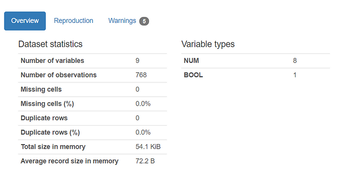
This report will give you some overall statistical information on the dataset, which looks like this:
By just glancing at the dataset statistics, we can see that there are no missing or duplicate cells in our data frame.
The information provided above usually requires us to run a few lines of codes to find, but is generated a lot more easily with Pandas Profiling.
Pandas Profiling also provides more information on each variable. I will show you an example:
This is information generated for the variable called “Pregnancies.”
As an analyst, this report saves a lot of time, as we don’t have to go through each individual variable and run too many lines of code.
From here, we can see that:
- The variable “Pregnancies” has 17 distinct values.
- The minimum number of pregnancies a person has is 0, and the maximum is 17.
- The number of zero values in this column is pretty low (only 14.5%). This means that above 80% of the patients in the dataset are pregnant.
In the report, there is information like this provided for each variable. This helps us a lot in our understanding of the dataset and all the columns in it.
The plot above is a correlation matrix. It helps us gain a better understanding of the correlation between the variables in the dataset.
There is a slight positive correlation between the variables “Age” and “Skin Thickness”, which can be looked into further in the visualization section of the analysis.
Since there are no missing or duplicate rows in the data frame as seen above, we don’t need to do any additional data cleaning.
“Get hands-on with our python course – sign up for a free demo!”
-
Identify three Python libraries and describe their uses.
Matplotlib:
Matplotlib is the standard graphing library in python, and is typically the first graphing library a data scientist will learn when using python. It is functionally integrated with pandas and numpy for easy and efficient plotting. Furthermore, Matplotlib gives the user full control over fonts, graph styling and axes properties, though this control comes at the potential cost of lengthy blocks of code. Matplotlib is especially good for performing exploratory analysis because of the integration with pandas, allowing for quick transformations from dataframe to graph. Matplotlib is particularly good for creating basic plots like scatter plots, bargraphs and lineplots, but looks a little rough when creating more complex plots like polar scatterplots.
Seaborn:
Seaborn is a library built on top of the pyplot module in Matplotlib. It provides a high level interface to create a more intuitive feel. This entails using a simpler syntax and more intuitive parameter settings. Additionally, Seaborn includes a more aesthetically pleasing collection of colors, themes and styles. This produces a smoother and more professional looking plot than those created from the pyplot module. This library is especially useful when creating more complex plots where more refined graphics
Plotly:
Unlike Matplotlib and Seaborn, Plotly is used to make interactive charts. While the plots look very similar to those produced by Seaborn in terms of graphics, they have the added utility of displaying information when a user hovers their mouse over the chart. This effect is accomplished by utilizing JavaScript behind the scenes and is a particularly useful feature when looking at busy or complex charts as you are immediately able to select the information that you are interested in. The drawback to using charts in Plotly, is that the code can get a bit complex and quite long depending on the method being used.
-
Read data using Python’s Pandas package.
To read the data frame into Python, you will need to import Pandas first. Then, you can read the file and create a data frame with the following lines of code:
import pandas as pd
df = pd.read_csv('diabetes.csv')
To check the head of the data frame, run:
df.head()From the screenshot above, you can see 9 different variables related to a patient’s health.
As an analyst, you will need to have a basic understanding of these variables:
- Pregnancies: The number of pregnancies the patient had
- Glucose: The patient’s glucose level
- Blood Pressure
- Skin Thickness: The thickness of the patient’s skin in mm
- Insulin: Insulin level of the patient
- BMI: Body Mass Index of patient
- DiabetesPedigreeFunction: History of diabetes mellitus in relatives
- Age
- Outcome: Whether or not a patient has diabetes
As an analyst, you will need to know the difference between these variable types — Numeric and Categorical.
Numeric variables are variables that are a measure, and have some kind of numeric meaning. All the variables in this dataset except for “outcome” are numeric.
Categorical variables are also called nominal variables, and have two or more categories that can be classified.
The variable “outcome” is categorical — 0 represents the absence of diabetes, and 1 represents the presence of diabetes.
What are the parts of Python data analysis?
We will start with downloading and cleaning the dataset, and then move on to the analysis and visualization.
Now that we have a basic understanding of each variable, we can try to find the relationship between them.
The simplest and fastest way to do this is by generating visualizations.
Visualizations can be done using the three libraries that have been already discussed above in the article — Matplotlib, Seaborn, and Plotly.


